Short Film.
Runtime 23min
Comedy Western genre.
Creators: Daniel Blum & Louis Riviere
Credits coming soon.
My role: Colorist and Finishing Artist
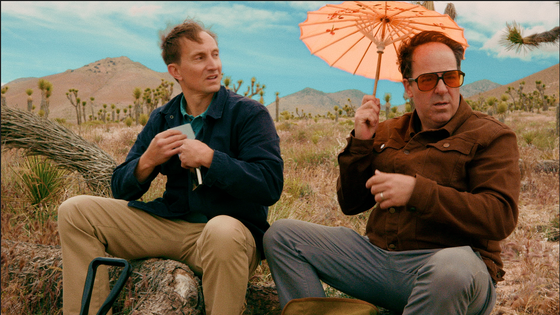
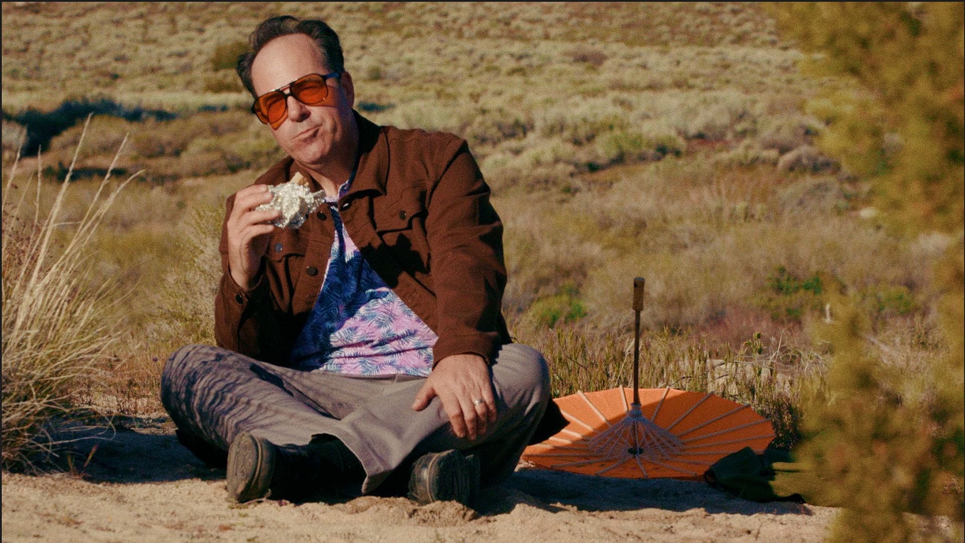
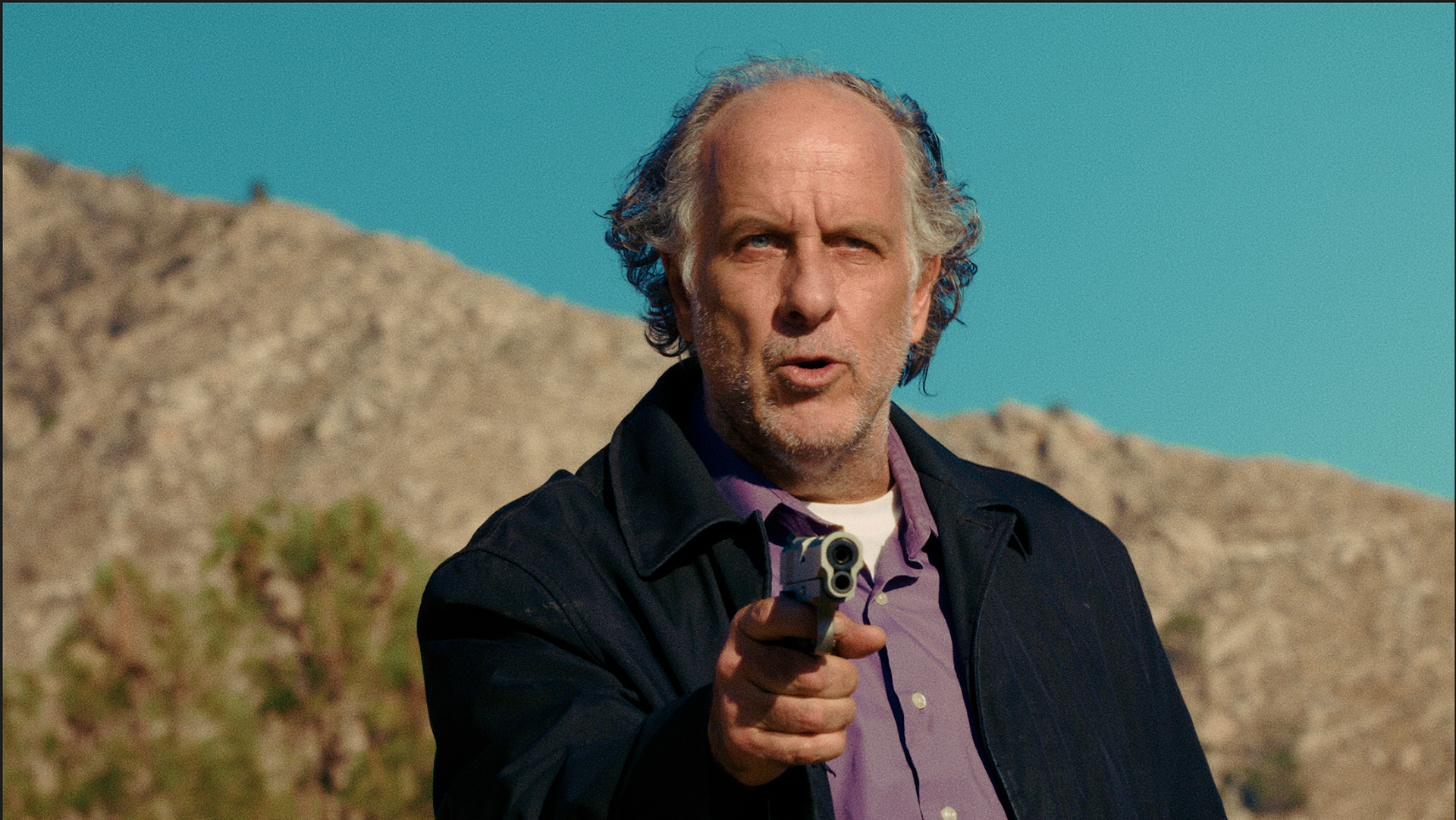
Tales from the Color Suite – "Son of Desert"
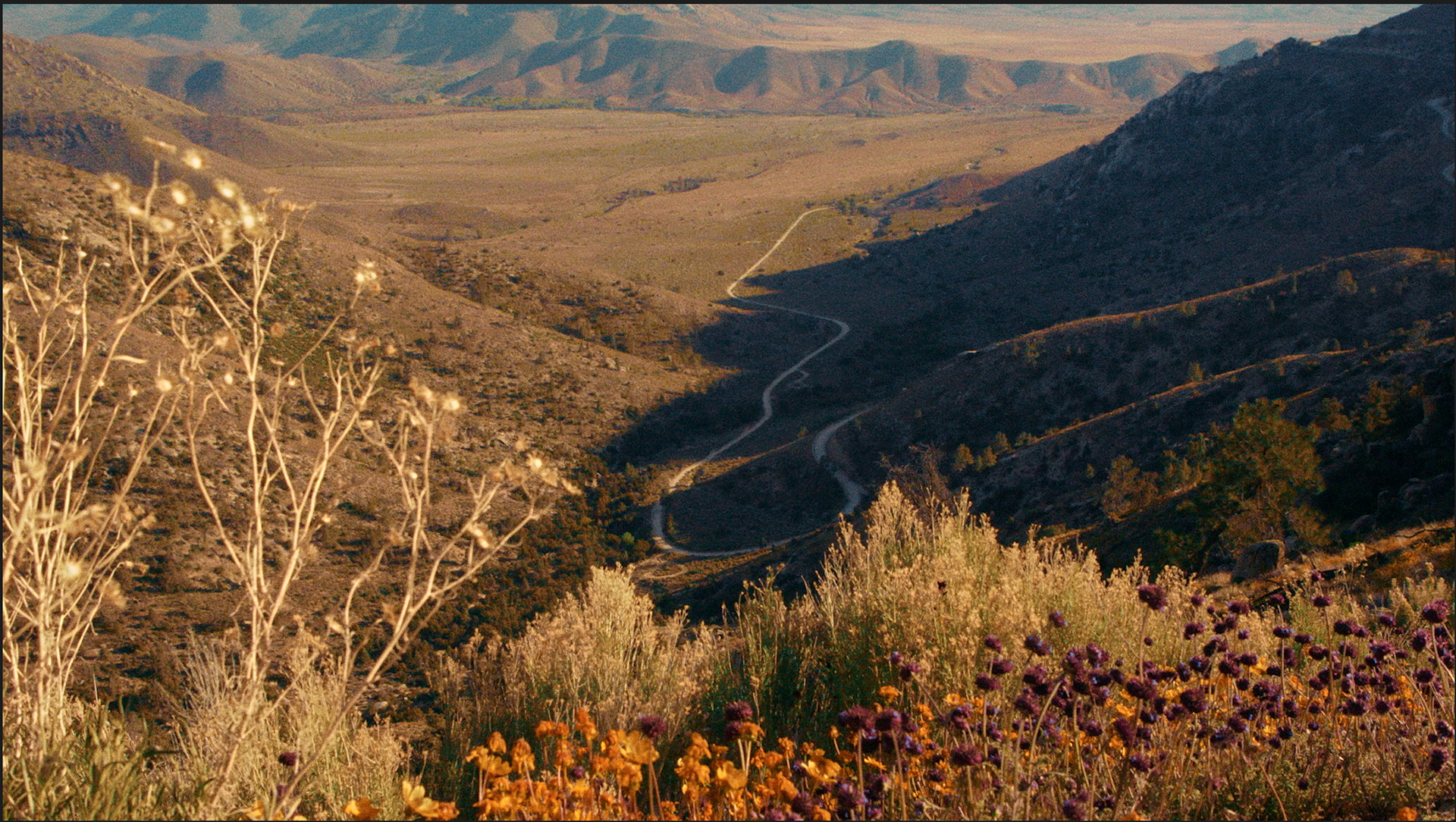
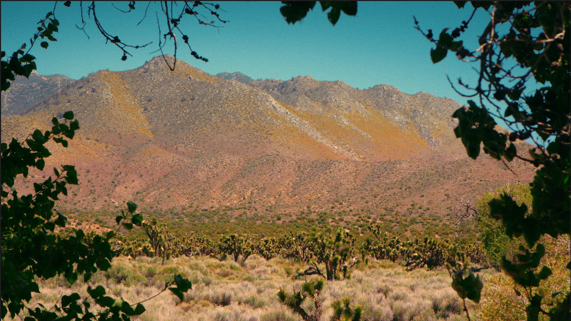
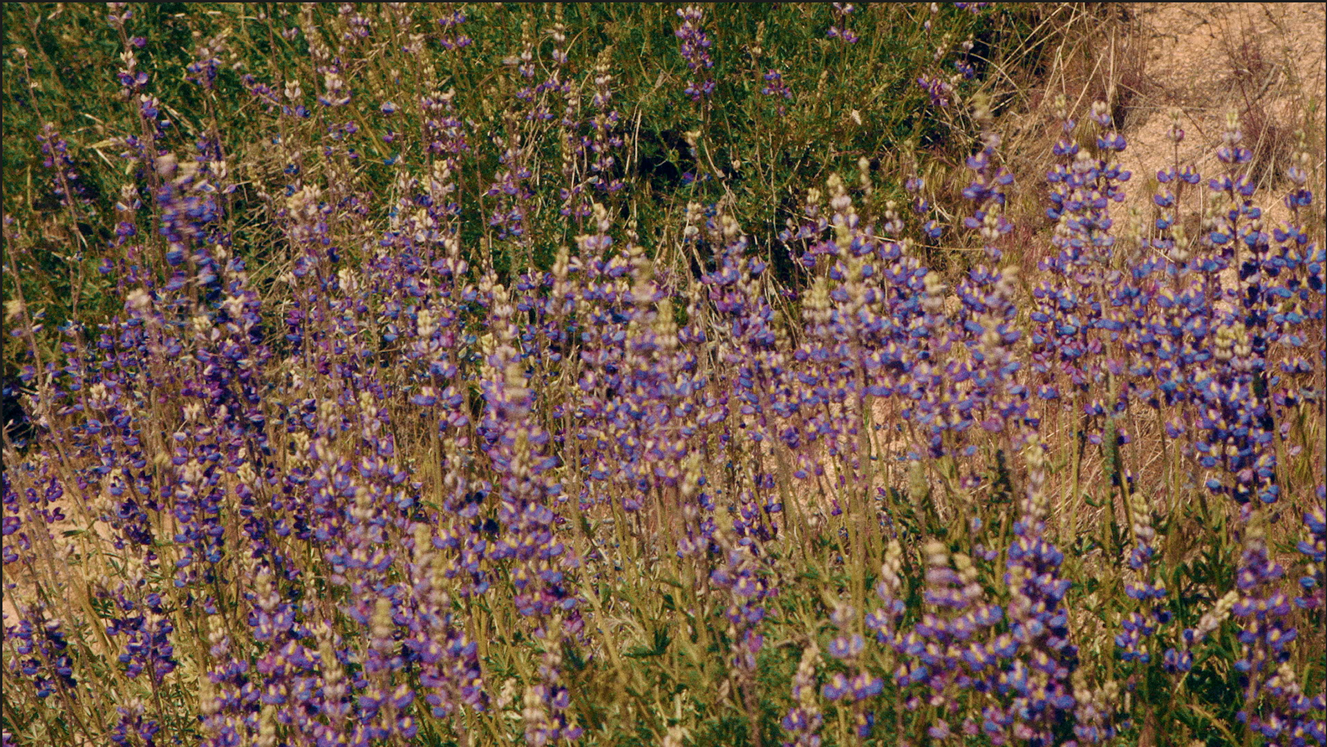
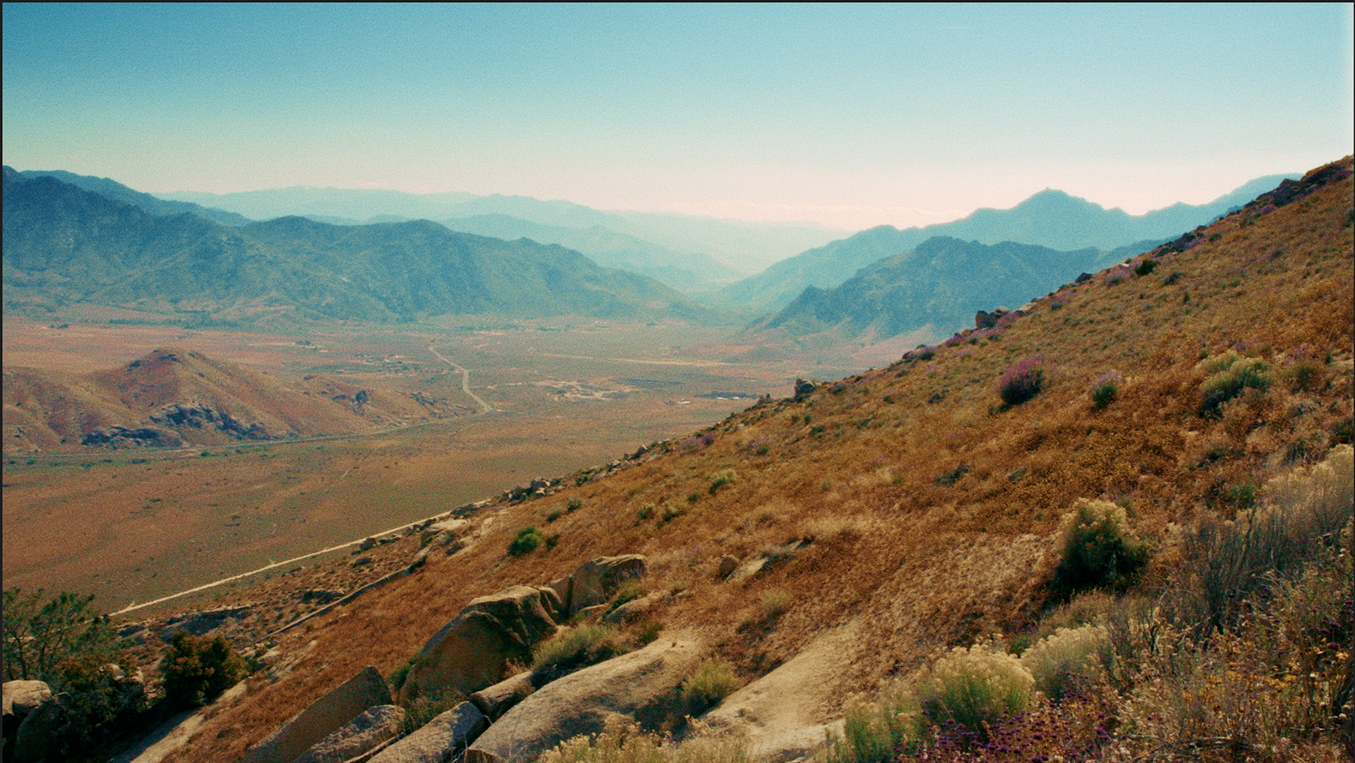
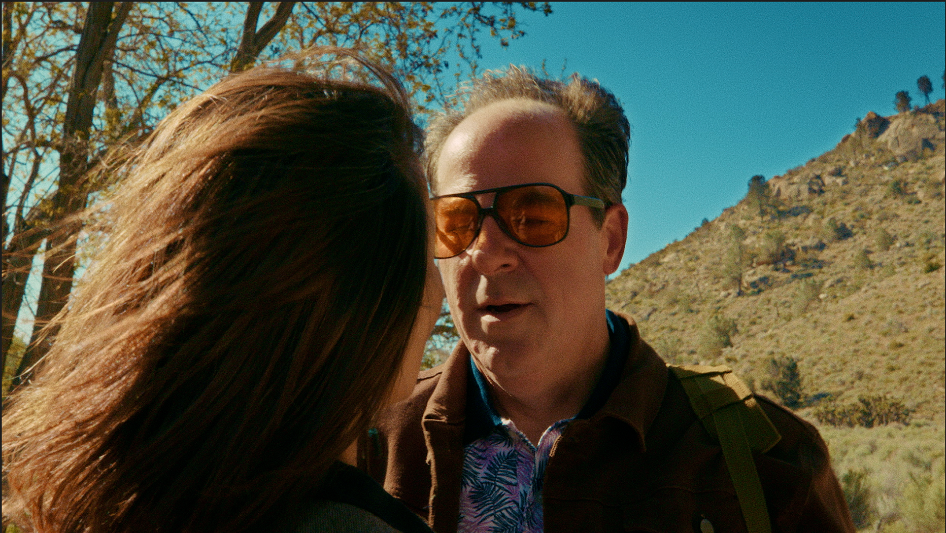
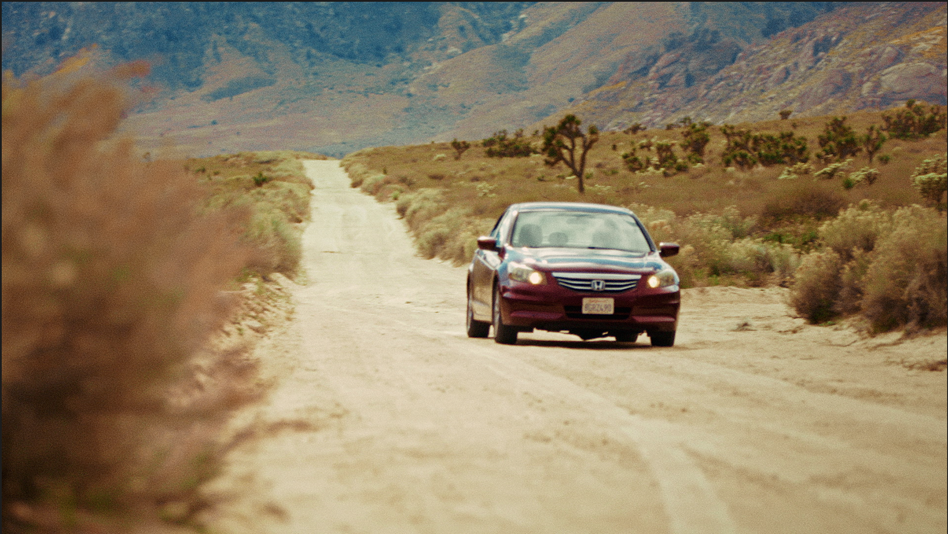
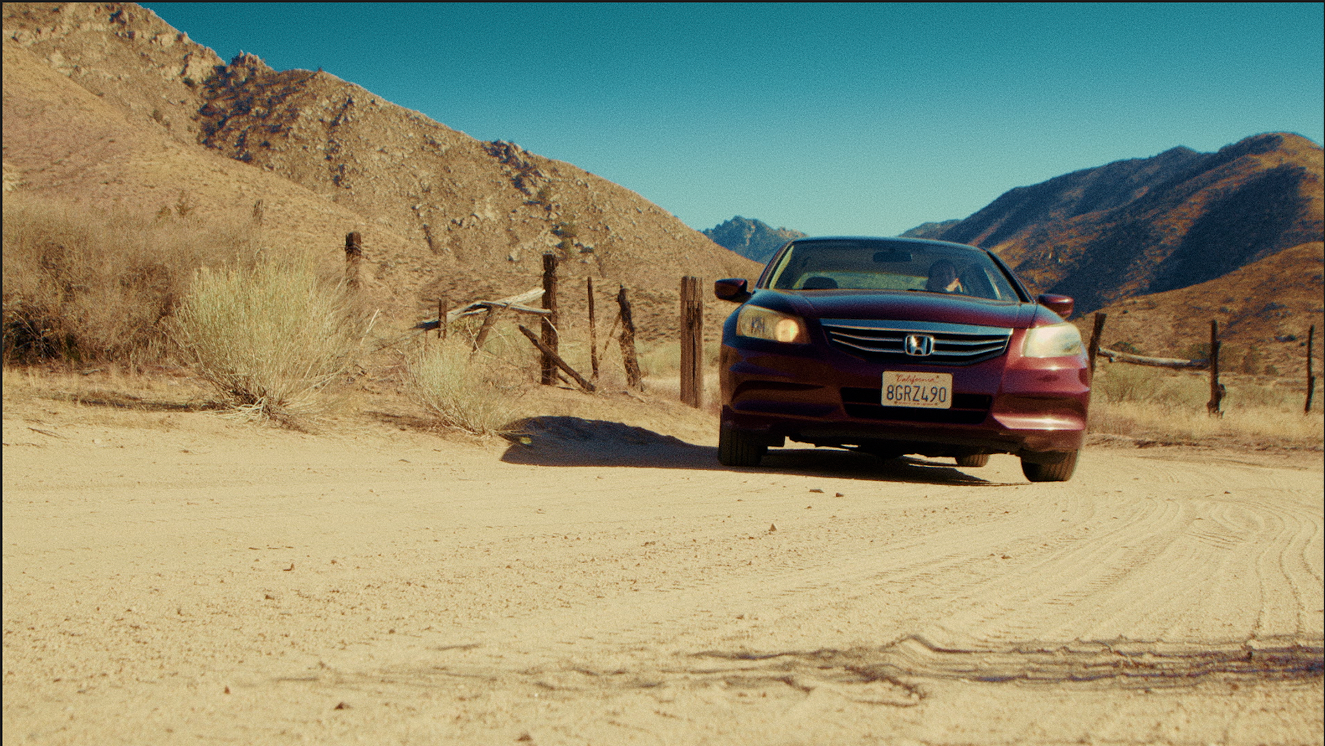
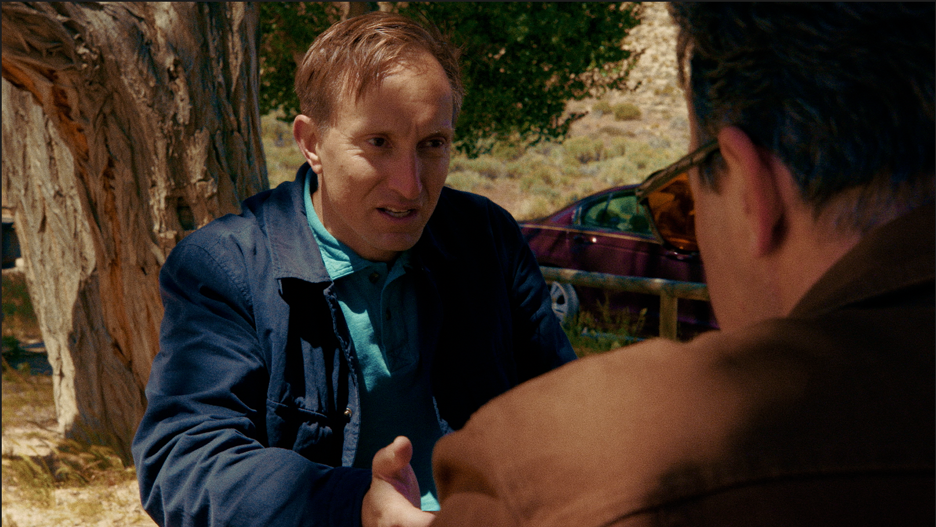
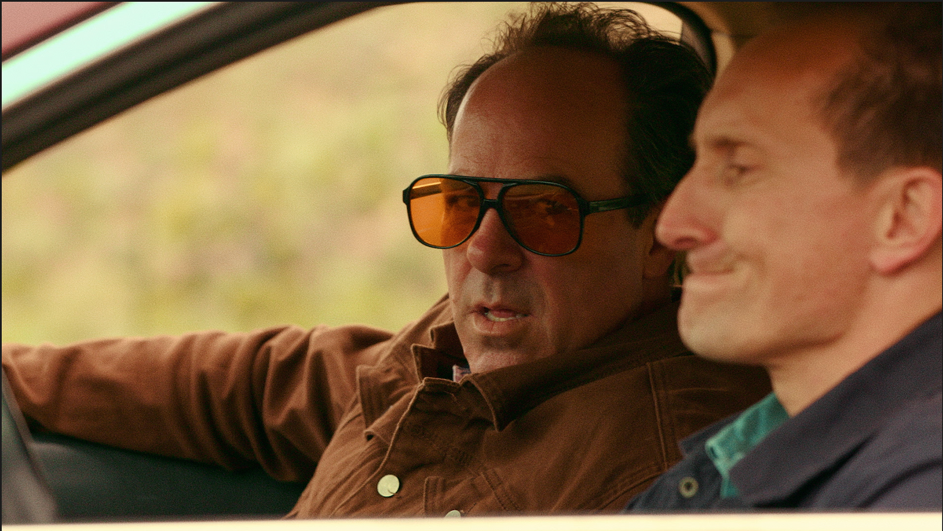
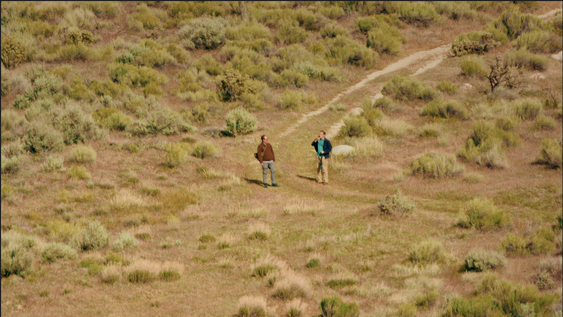
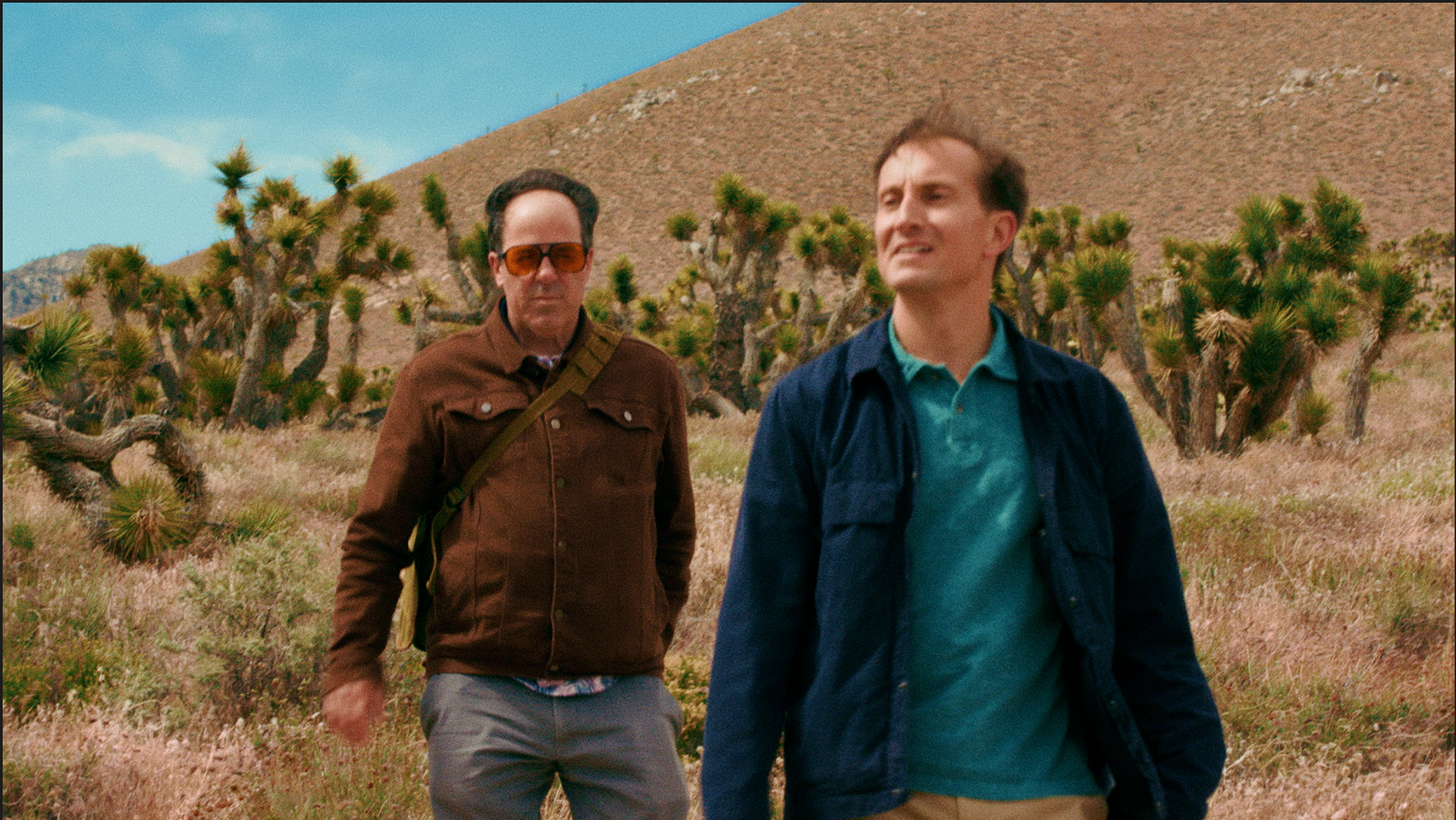
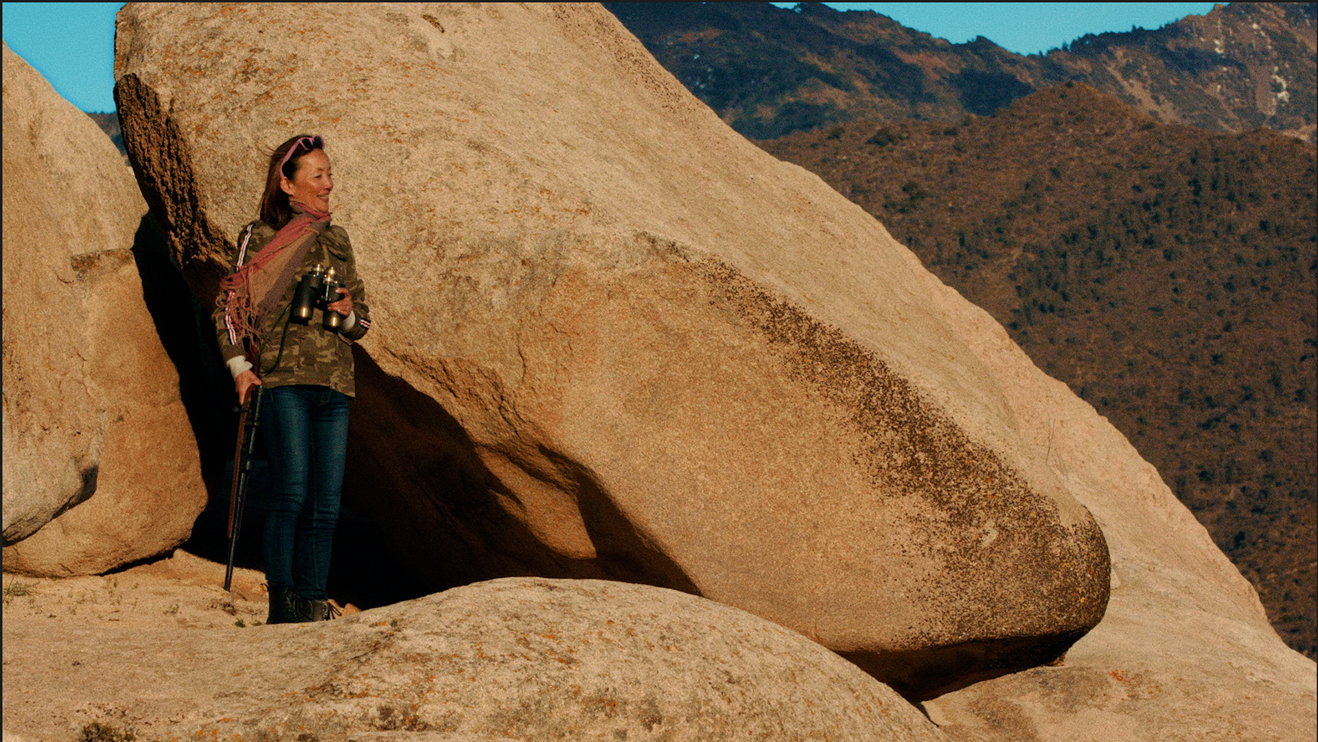
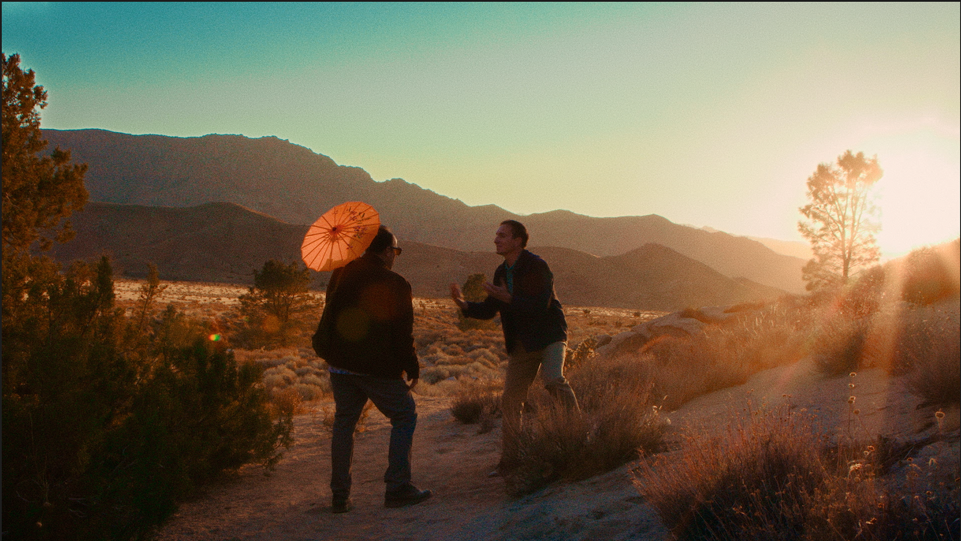
Aah… it’s lovely to catch the realism of the world around you. That is what this project reminded me of. Before we started grading, the directors told me about the beauty of the desert, the colorful environment, and its presence as a character in the film—and how important that would be in the grade of "Son of Desert".
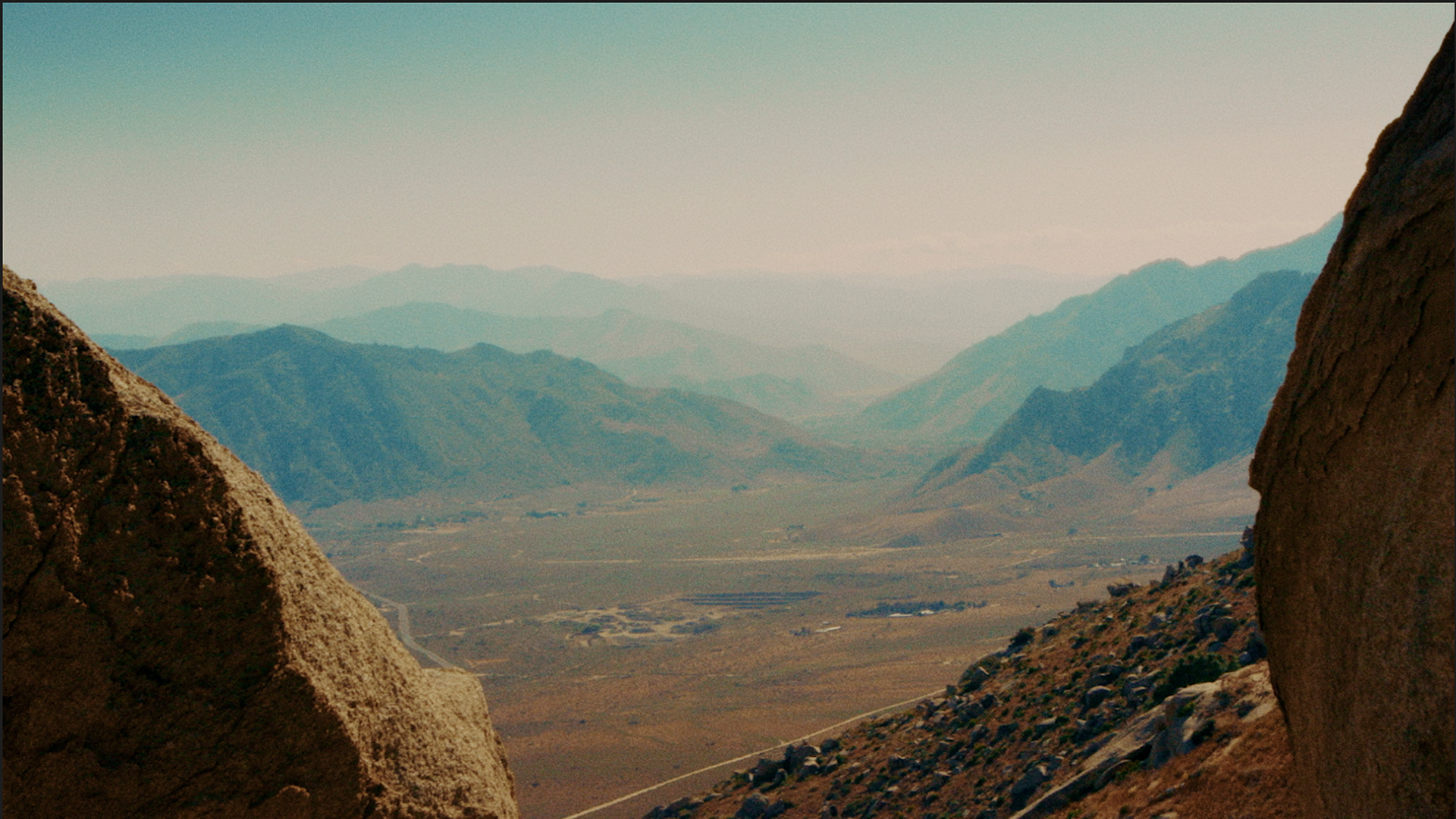
As I dove into the color design and the overall vision I was forming for the film, I realized I was actually missing some of those environmental notes the clients were so adamant about. I approached the project as I normally do, but this time I was laser‑focused on refining a look I personally liked. I instinctively leaned into a western‑inspired palette—more monochromatic and subdued—which felt, at first, like a great way to represent the desert.
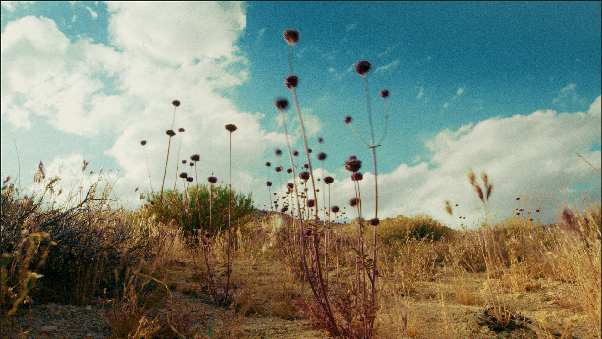
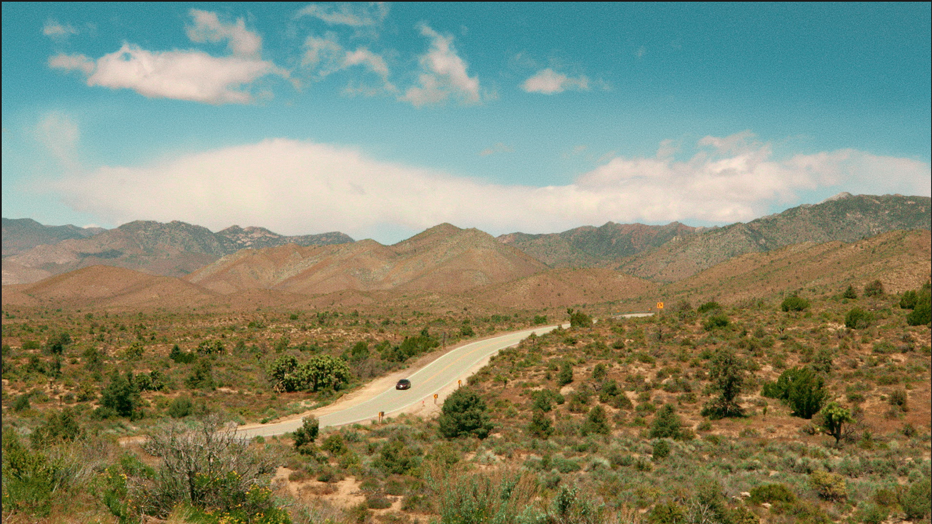
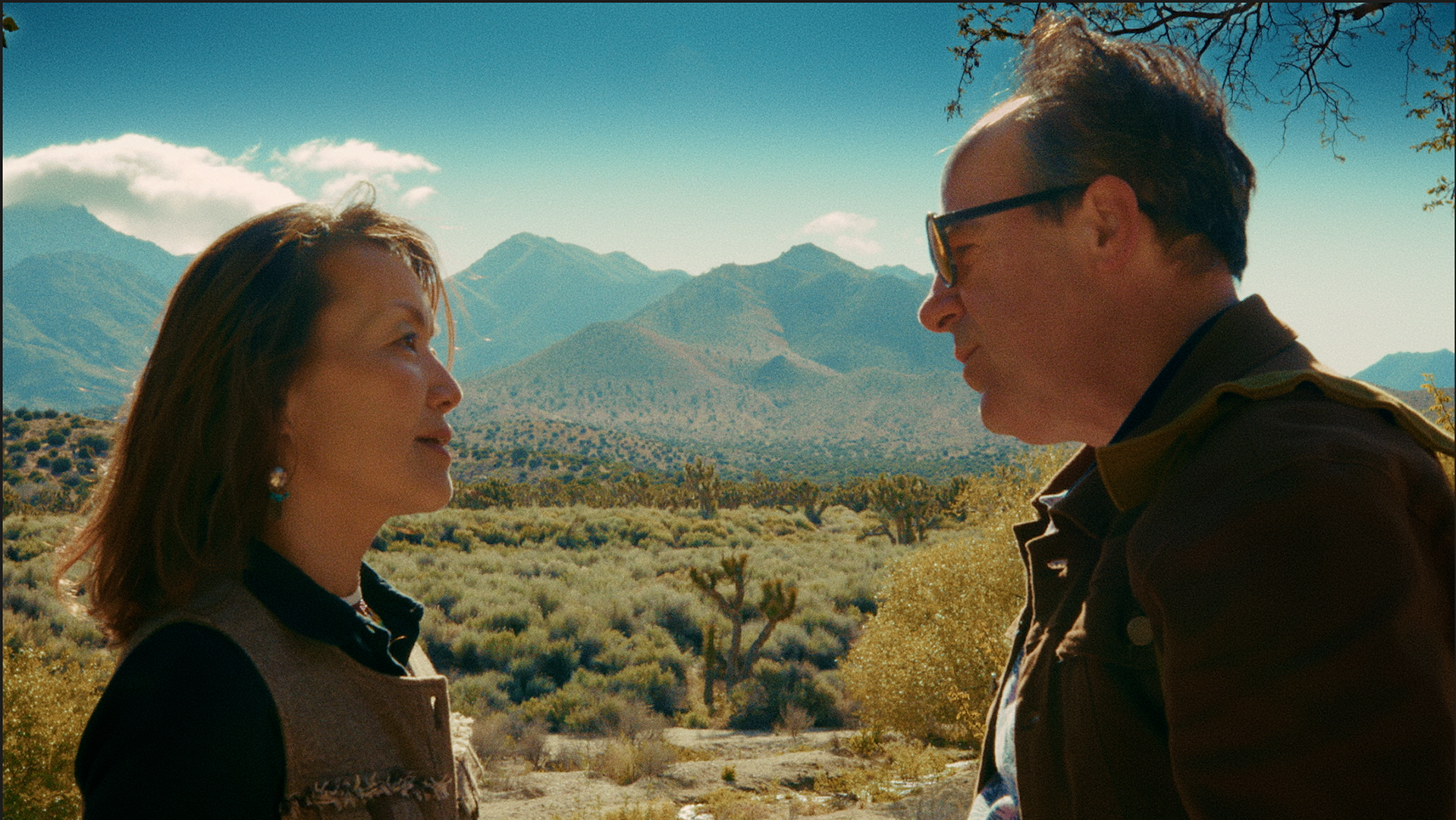
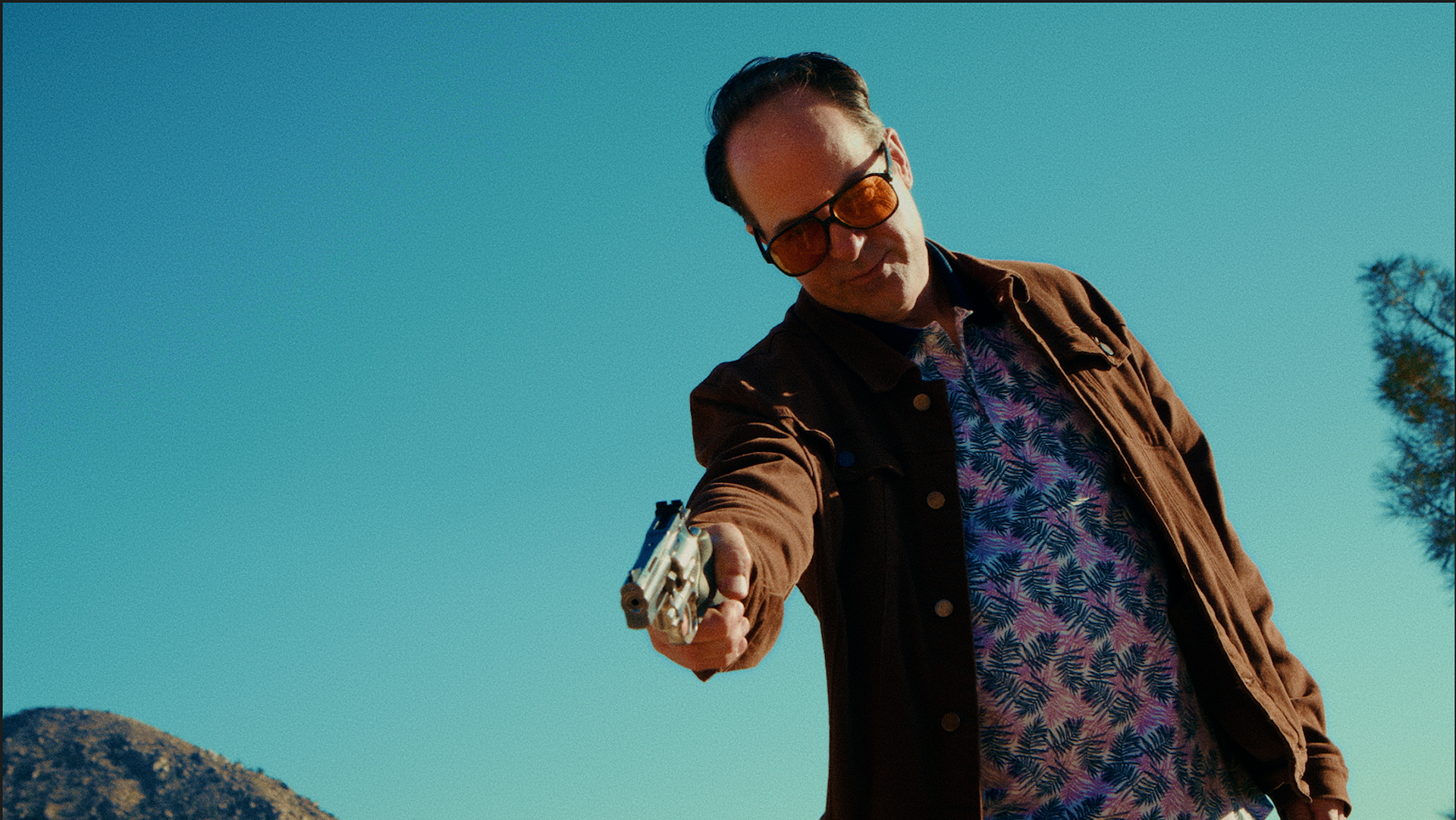
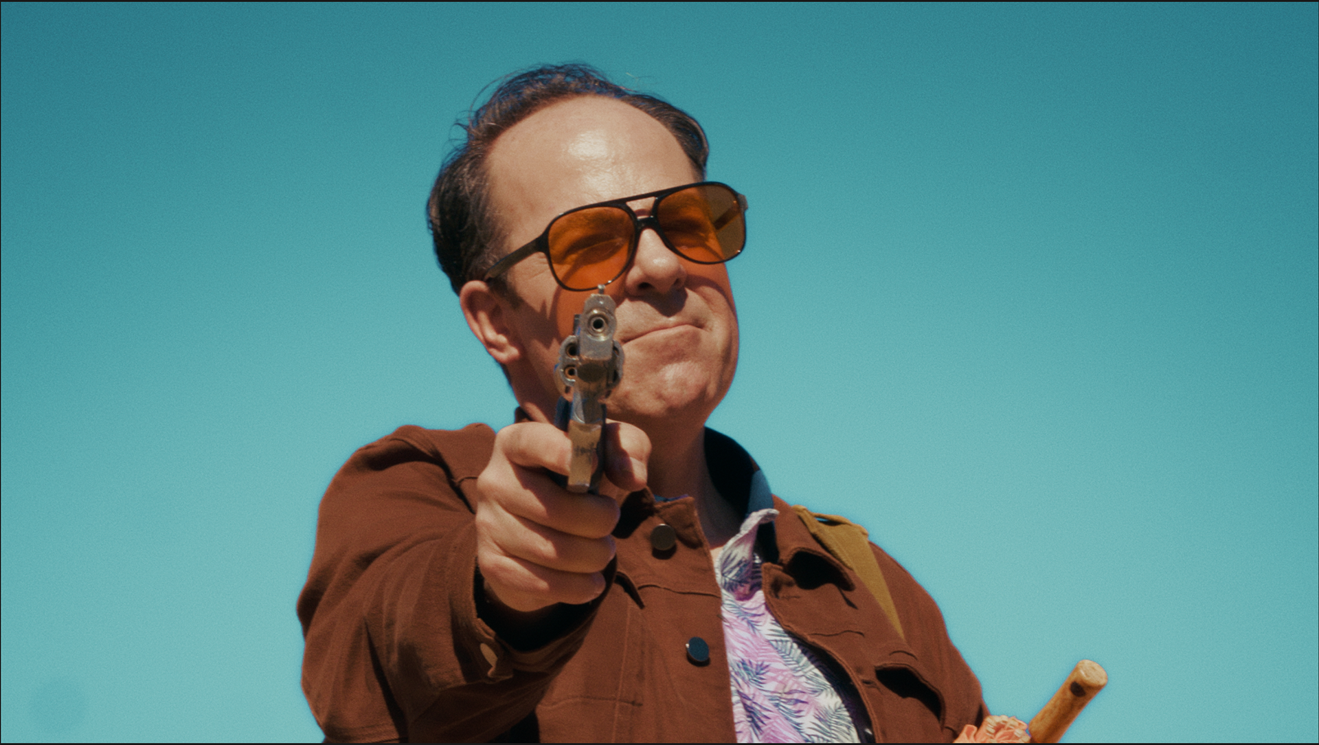
My interpretation of the film pushed me toward its comedic elements, its western DNA, and its baked desert warmth. Also the client wanted to embellish and maintain a consistency on the sky through the film. That combination led me to pitch a Wes Anderson–style approach to the grade. During testing, it played beautifully with the art direction and the humor of the script, and it clearly piqued Dan and Lou’s interest. When we started to negotiate the project, they did not have a defined color strategy, but they did express a clear intention to honor classic westerns, and I took that as my north.
After the first round of comments, even though they liked the direction, we had somehow muted the environments, and we were in danger of losing the desert’s presence and beauty. I began questioning whether this look would really work for the film, and possibly now working against me.
So I listened. Somehow I realized that maybe I was bias as to whether a dessert could be colorful within its beauty. I knew that the grade we created was the right approach; so I opened up my filters and allowed colors peak through, and started treating the desert as an important character in the plot, just as the client intended __et voilà!
Color design is a beautiful, collaborative endeavor that needs to be pressed and shaped like clay. Projects like this remind me how much love and respect I have for the craft, the artists, the talent, and the creators.