(2026) Feature Film
Runtime 85min
4K DCI Scope 2.39
LADY OF ERMINE PRODUCTIONS
Written, Directed & Produced - Donna DiGiuseppe
Executive Producer - Donna DiGiuseppe, Rick Matcovich, Simone D'Alessandro, Gabriele Bucari
Line Producers - HEIDI SCHOOLER, T Davis, Rick Matcovich, HENRY GREENTHAL
Editor - Teressa Longo
Director of Photography - Cliff Traiman
Production Designer - Jacquelyn Scott
Original Score - Alexis Soto Jr.
Colorist and Finishing Artist - MARCO RAMIREZ
MAIN CAST
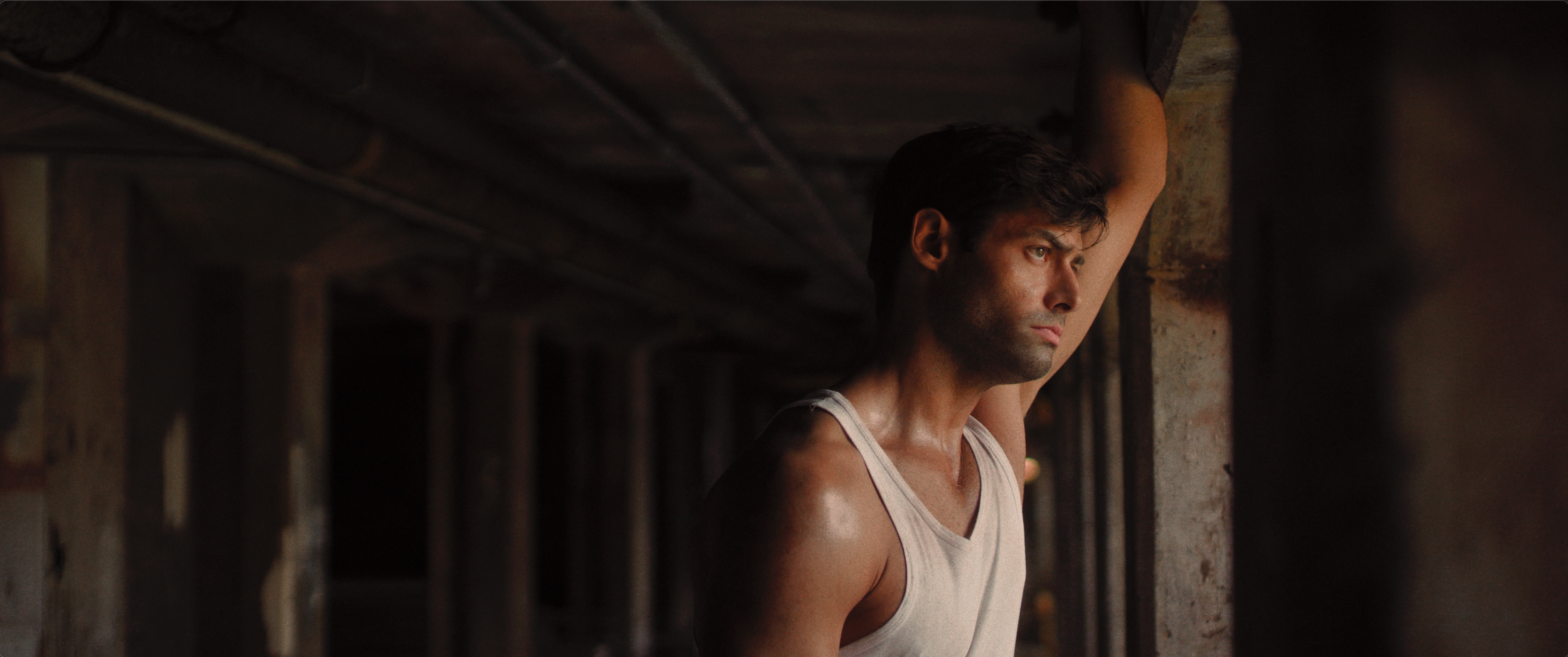
Antonio Di Rossi - Andrew Rogers
Mary Green - Toni Maddocks
Valeria Di Rossi - Valeria Di Menno
Sister Martha - Heidi Schooler
Il Padrone - Mario Massari
Anne Green - Rose Mcavoy
Virginia "Jenny" Webster - Isabella Basco
Tony Rossi - Kevin Medlin
Josh Greenberg - Joshua Malekos
Featuring the golden voices of Peter Coyote and Luciano Pavarotti
NOTES FROM THE COLOR SUITE
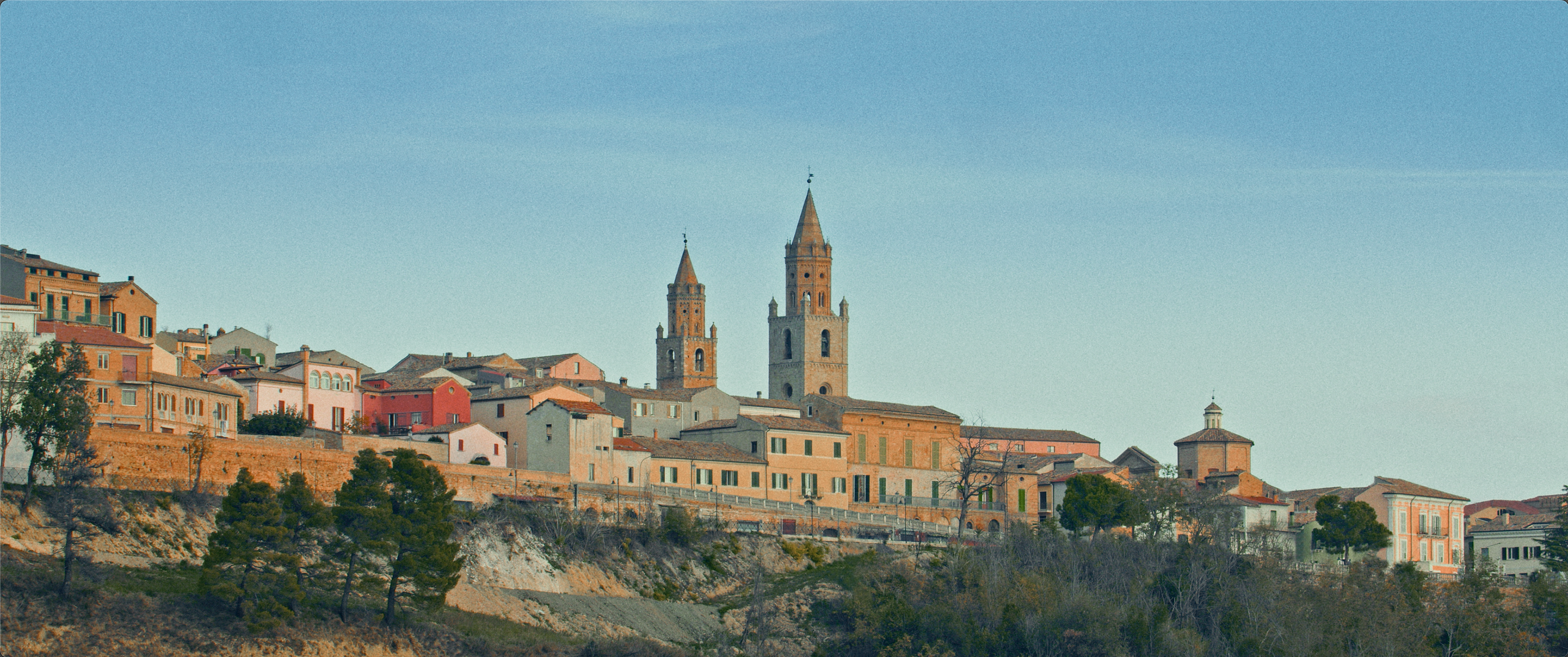
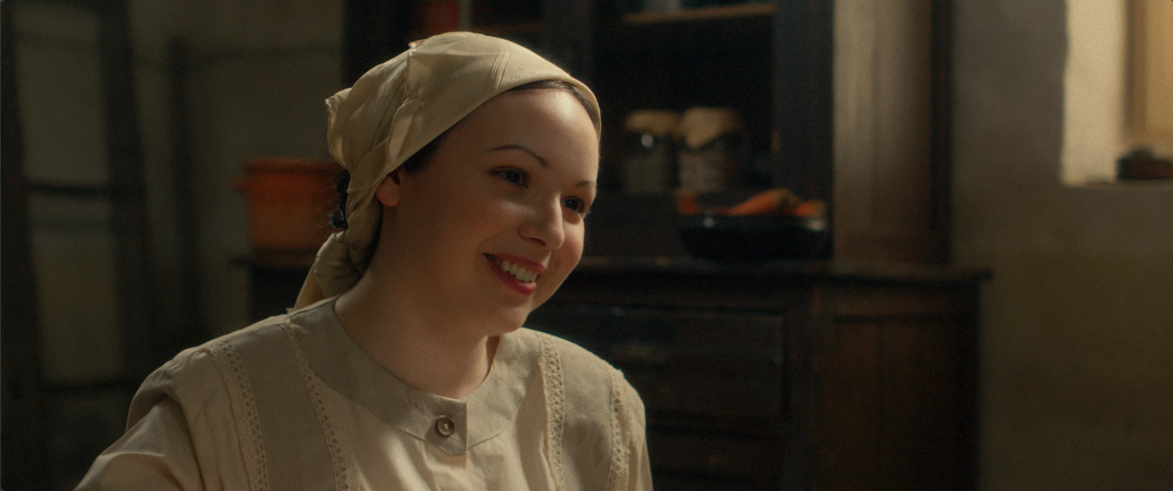
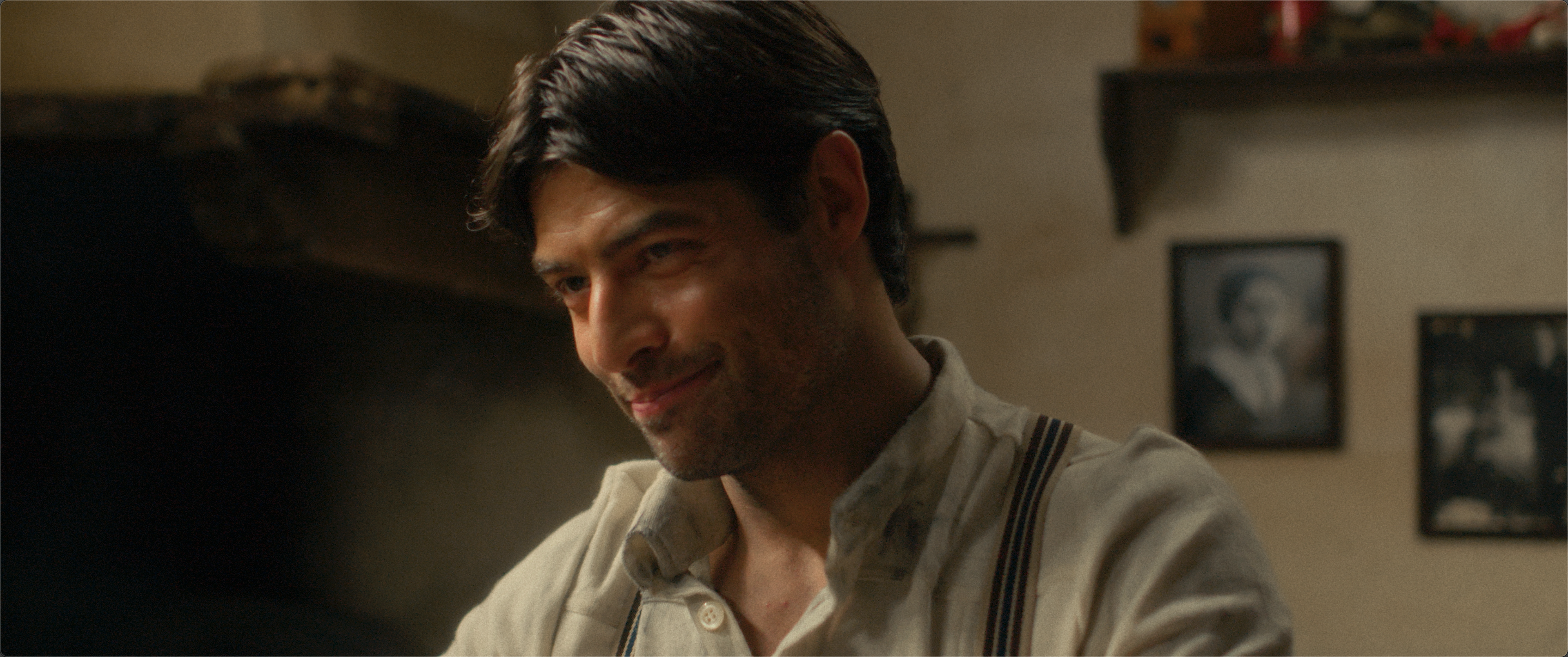
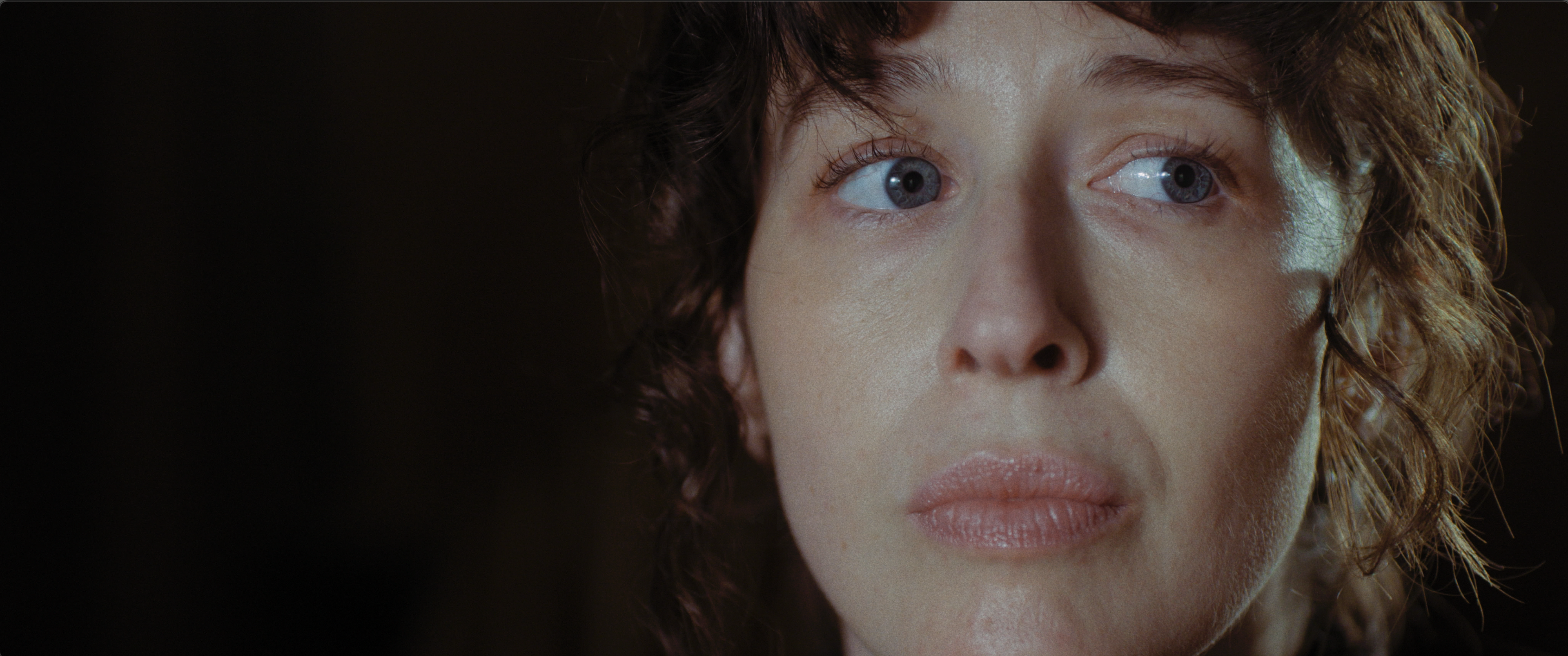
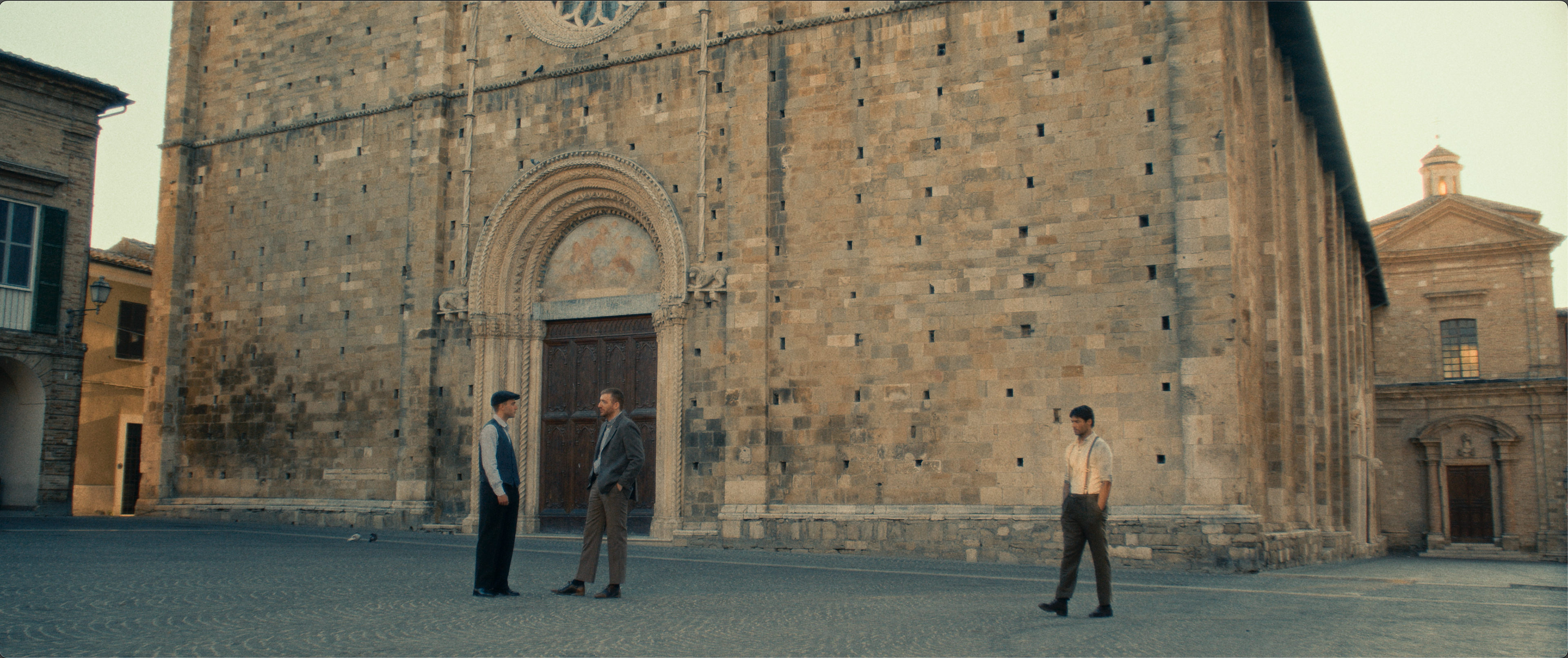
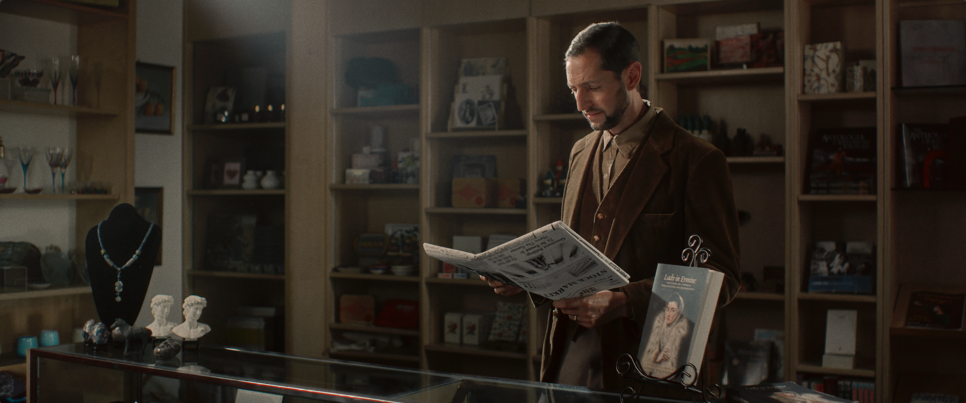
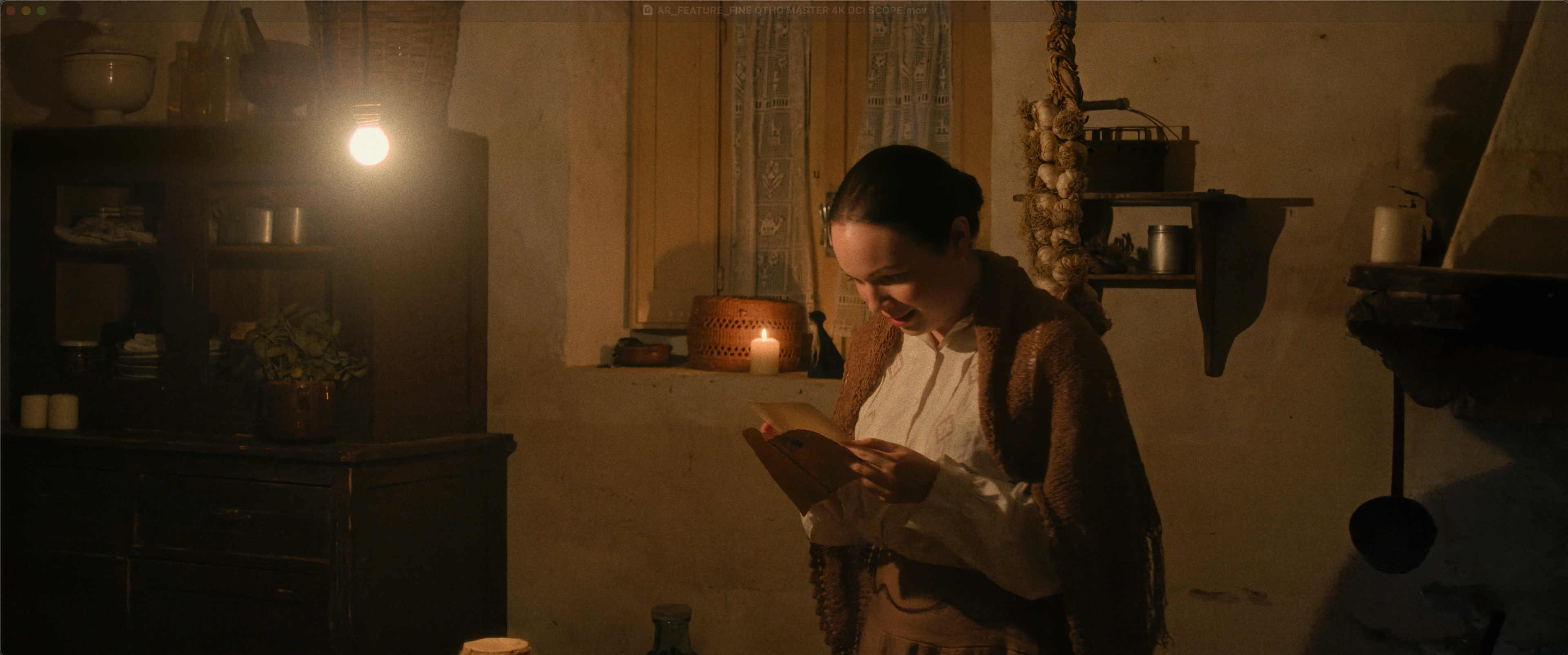
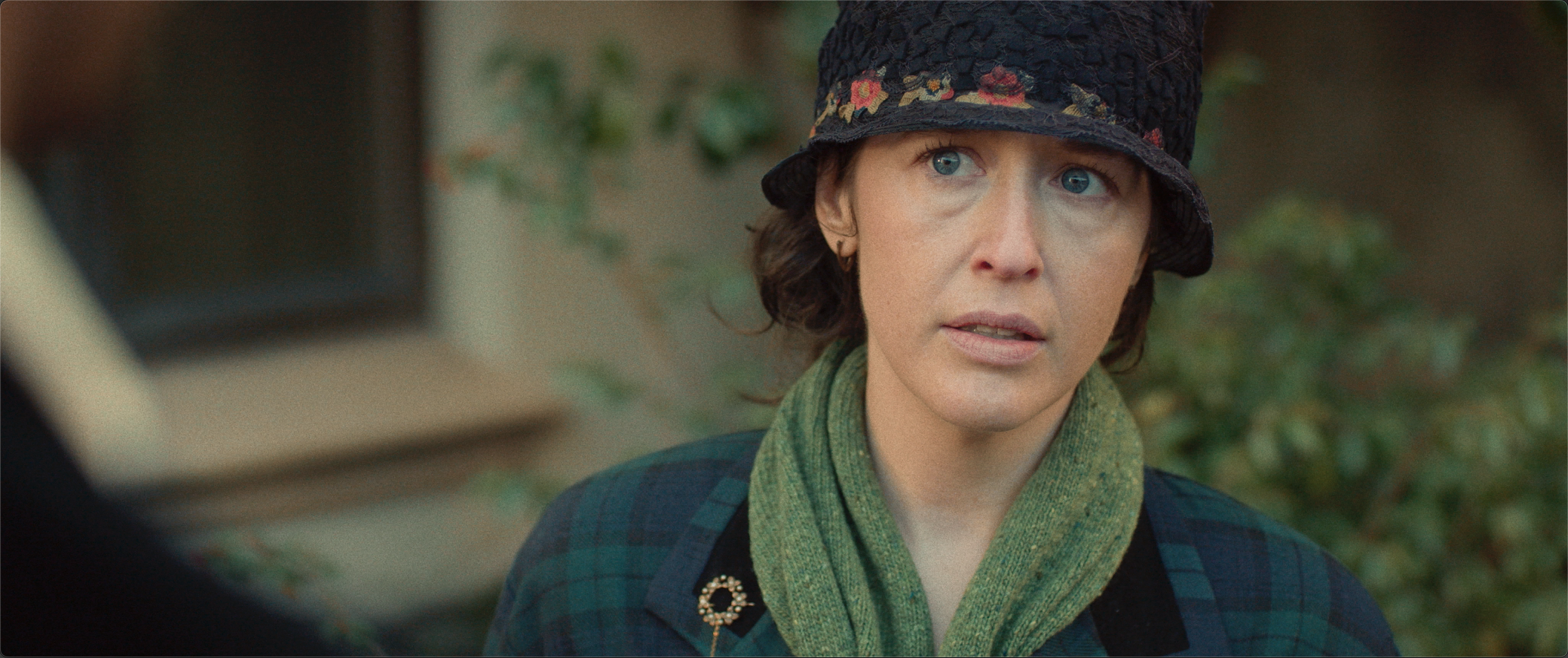
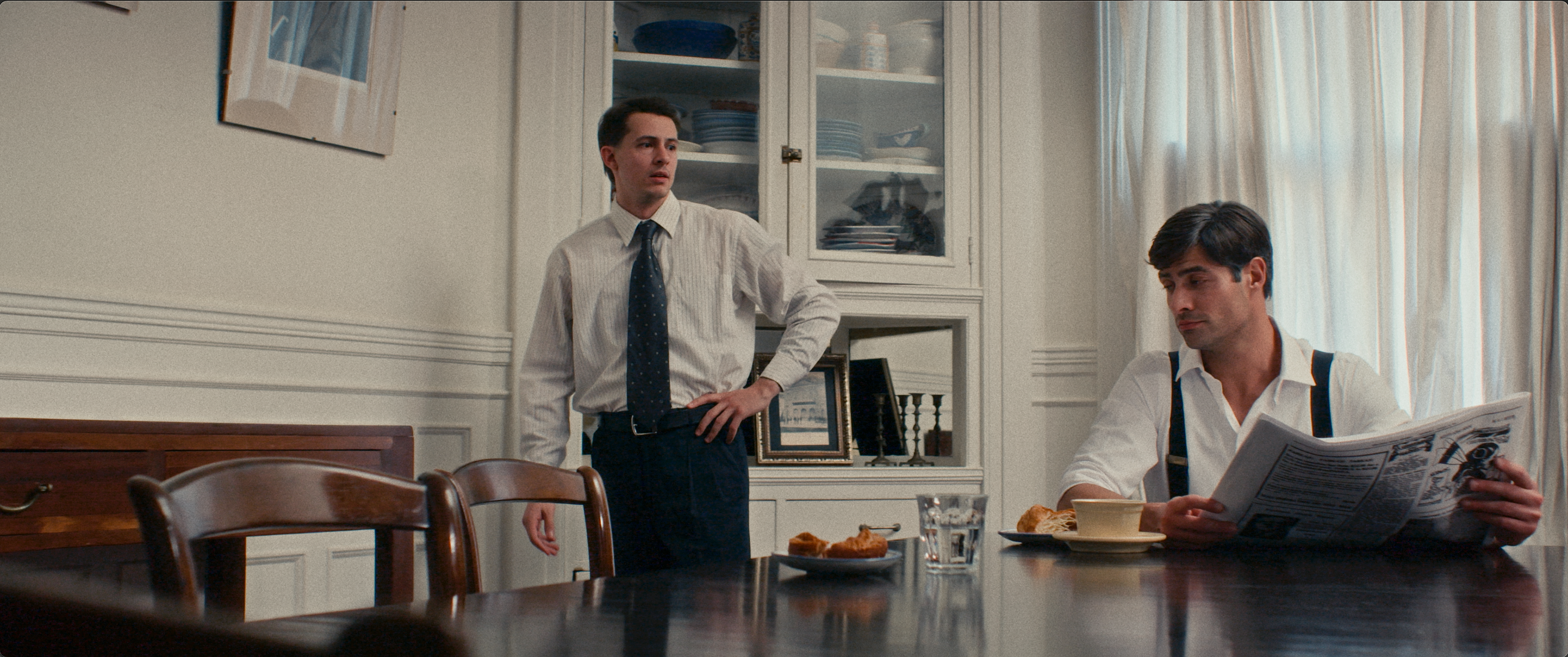
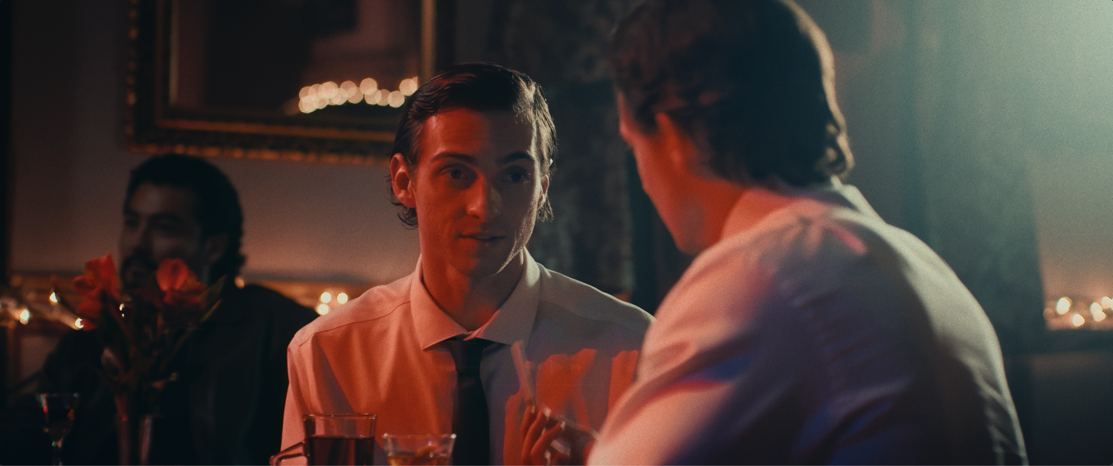
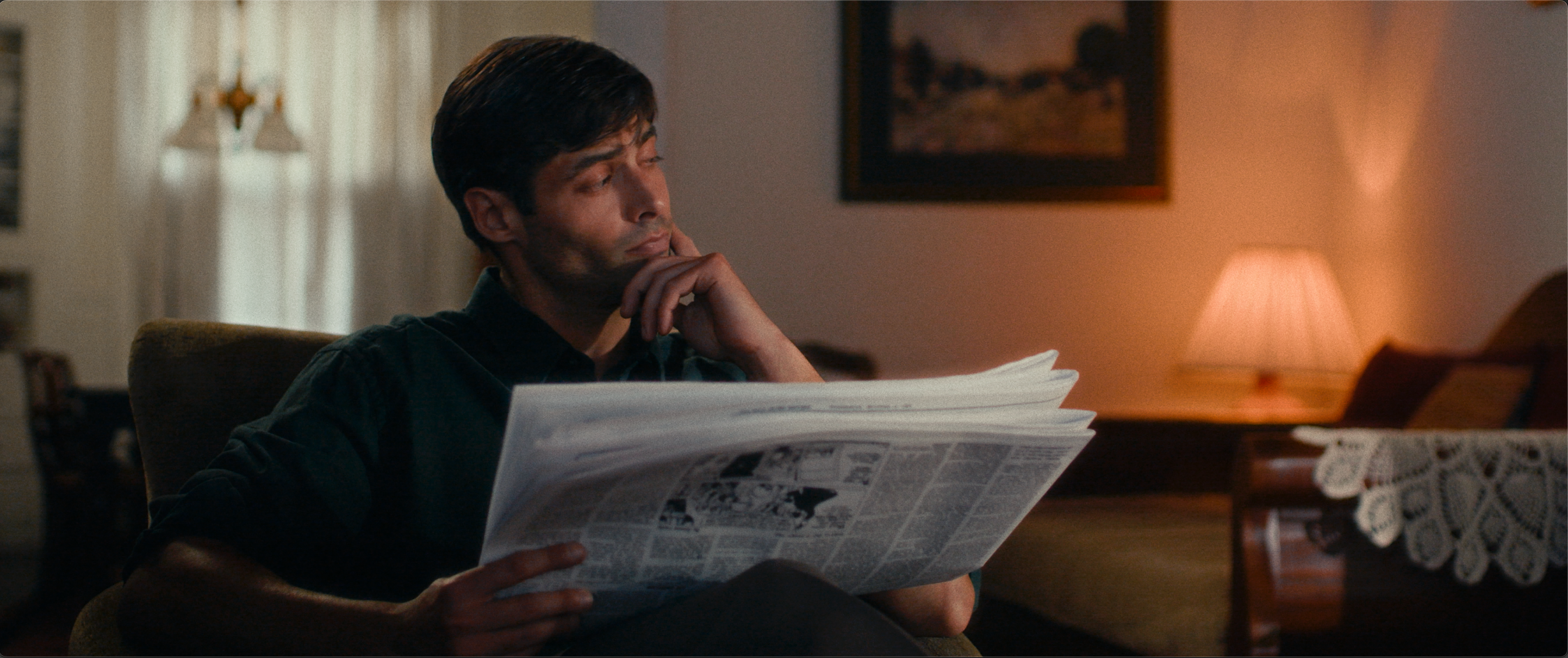
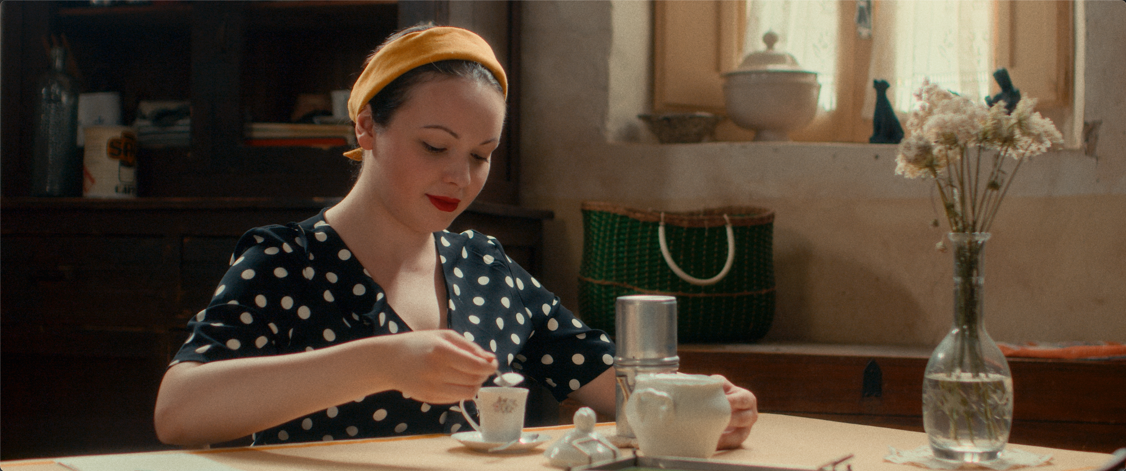
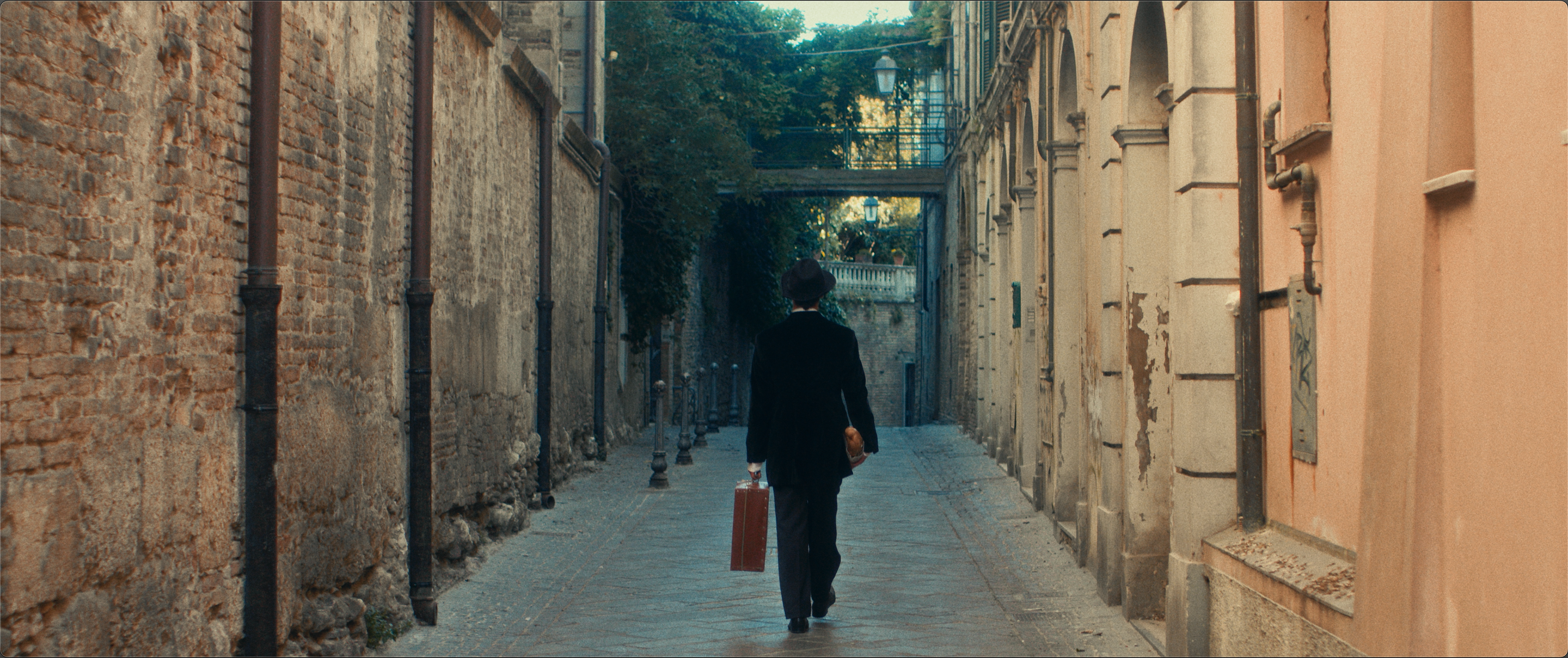
AR is a film that lives between the 1920s and the 1950s, and the grade had to travel through time with it. To build that journey I researched digital emulations that would help me embody the time period: Kodak Aerocolor for the 1950s sequences, Fuji‑style color for Ireland, and LomoChrome‑inspired looks for the 1920s, and a film print backbone of the Kodak2383.
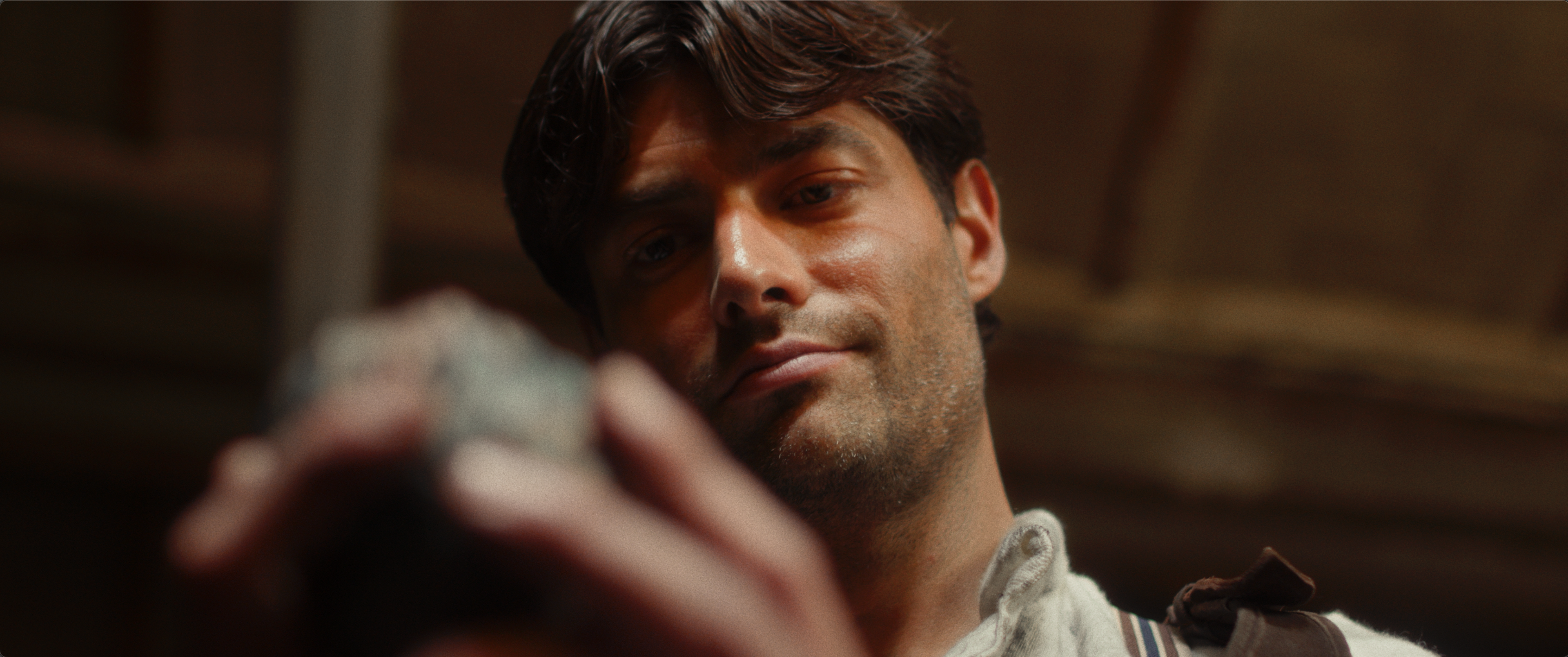
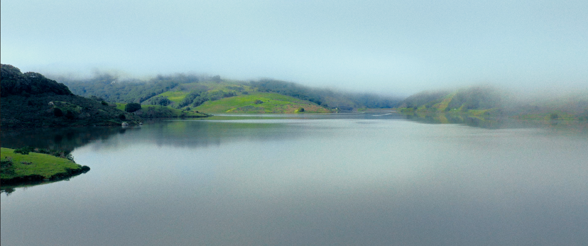
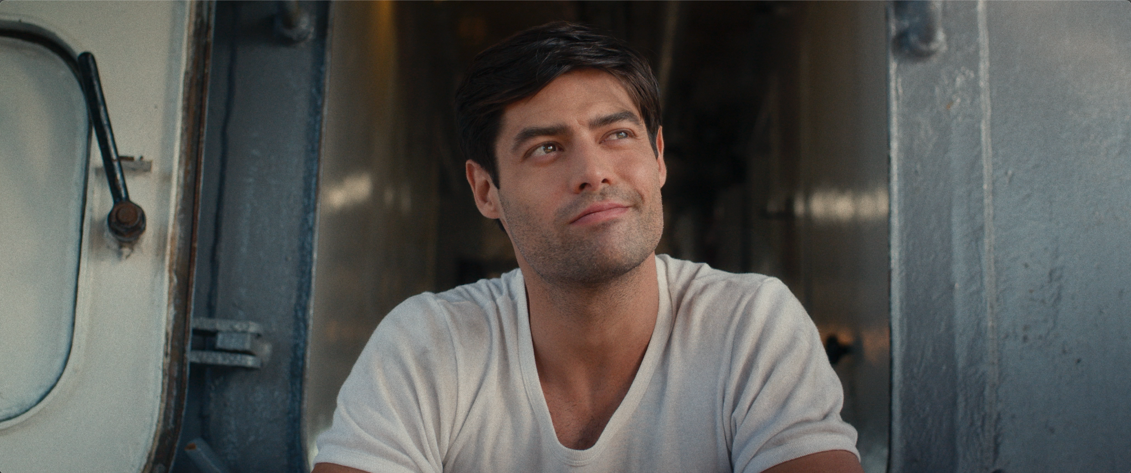
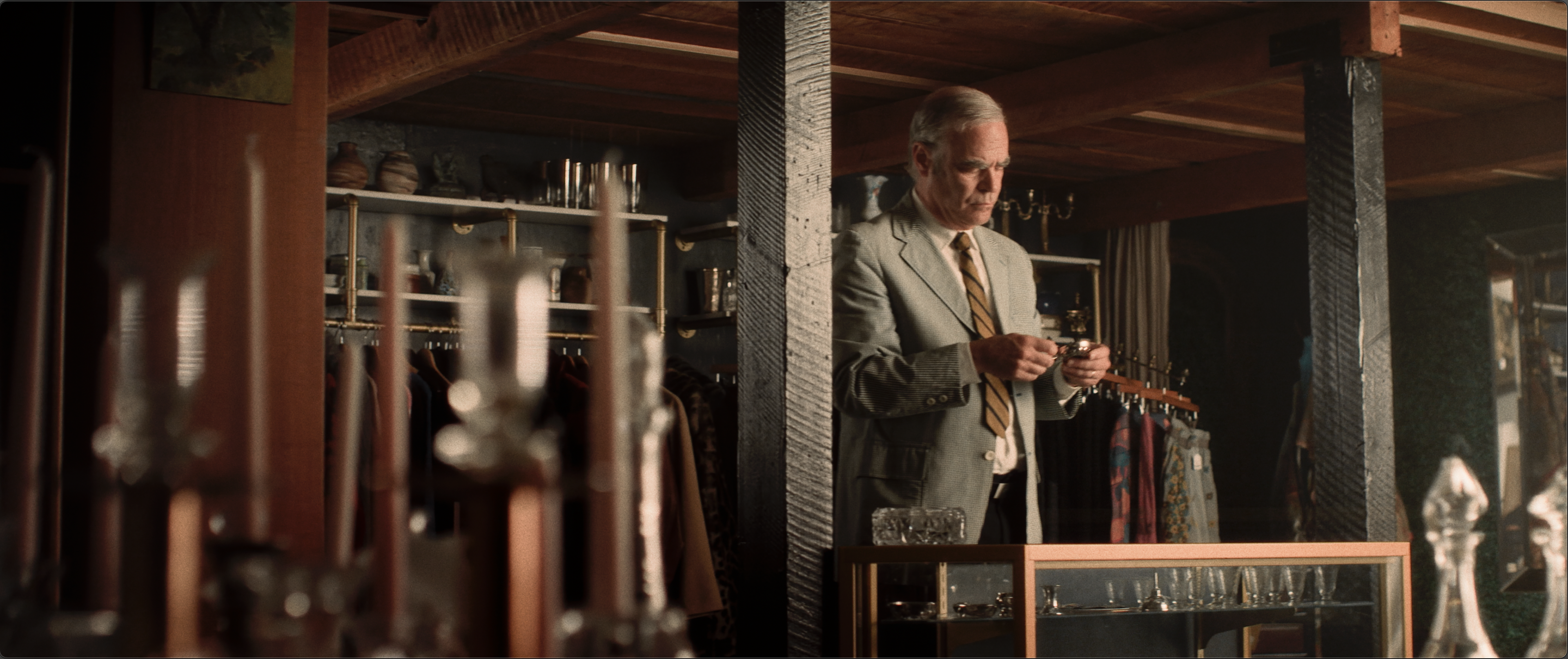
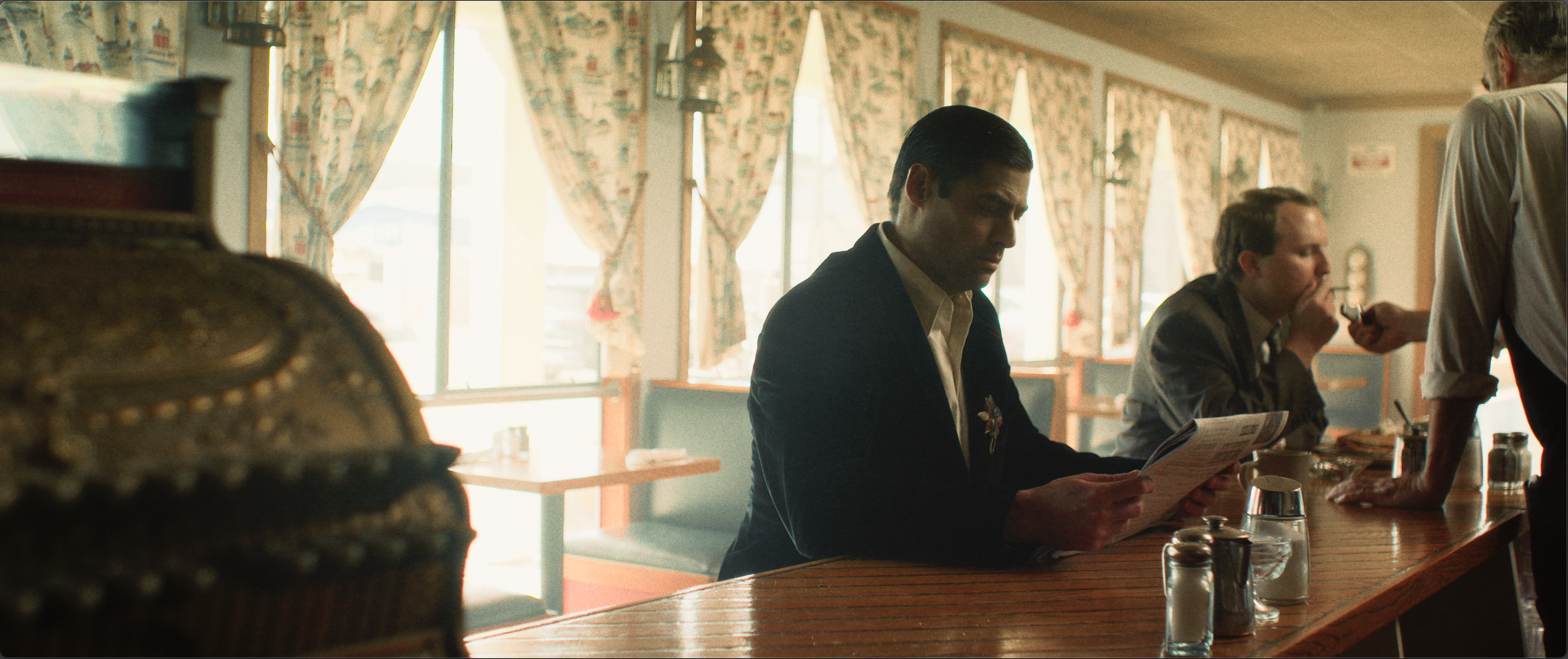
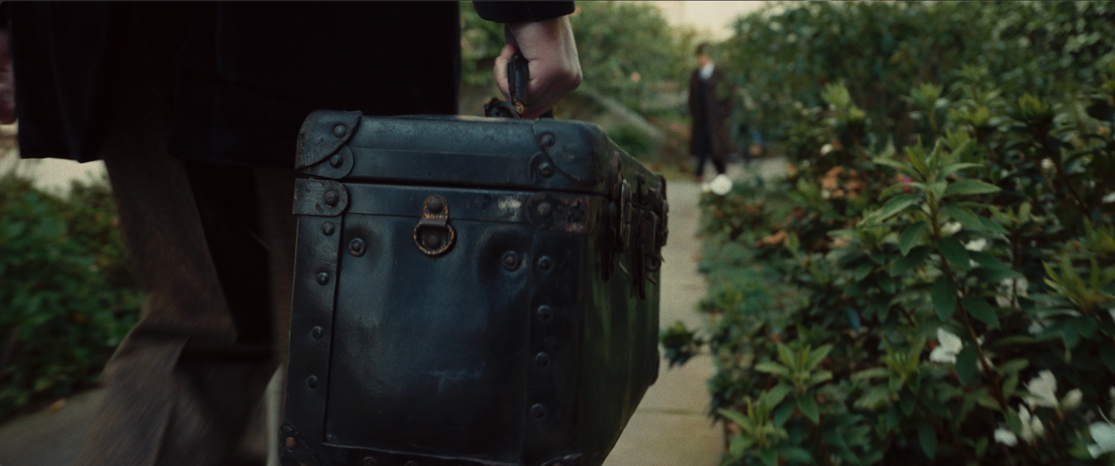
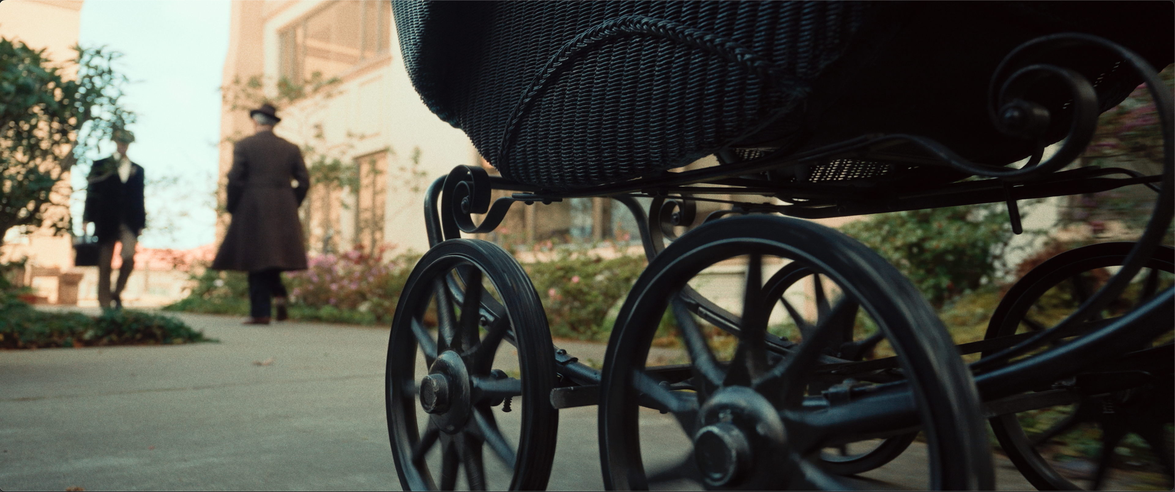
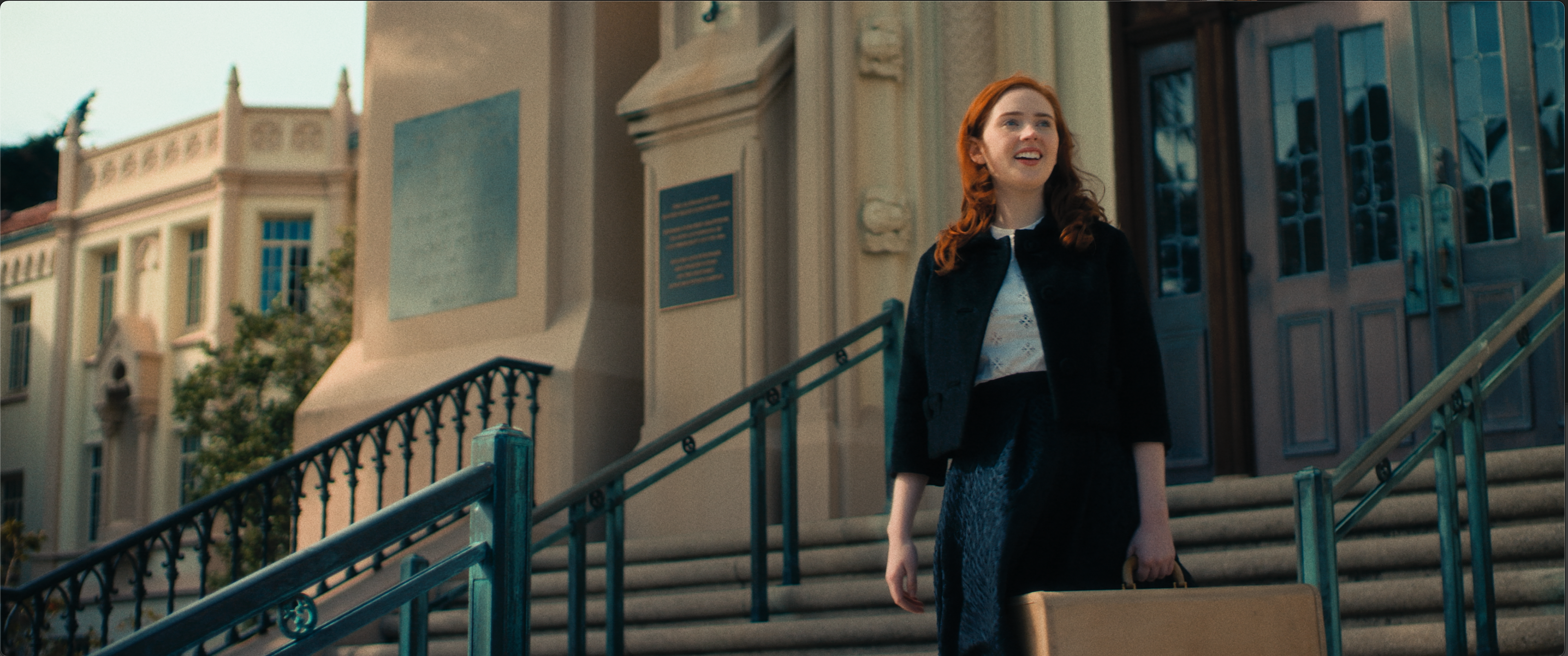
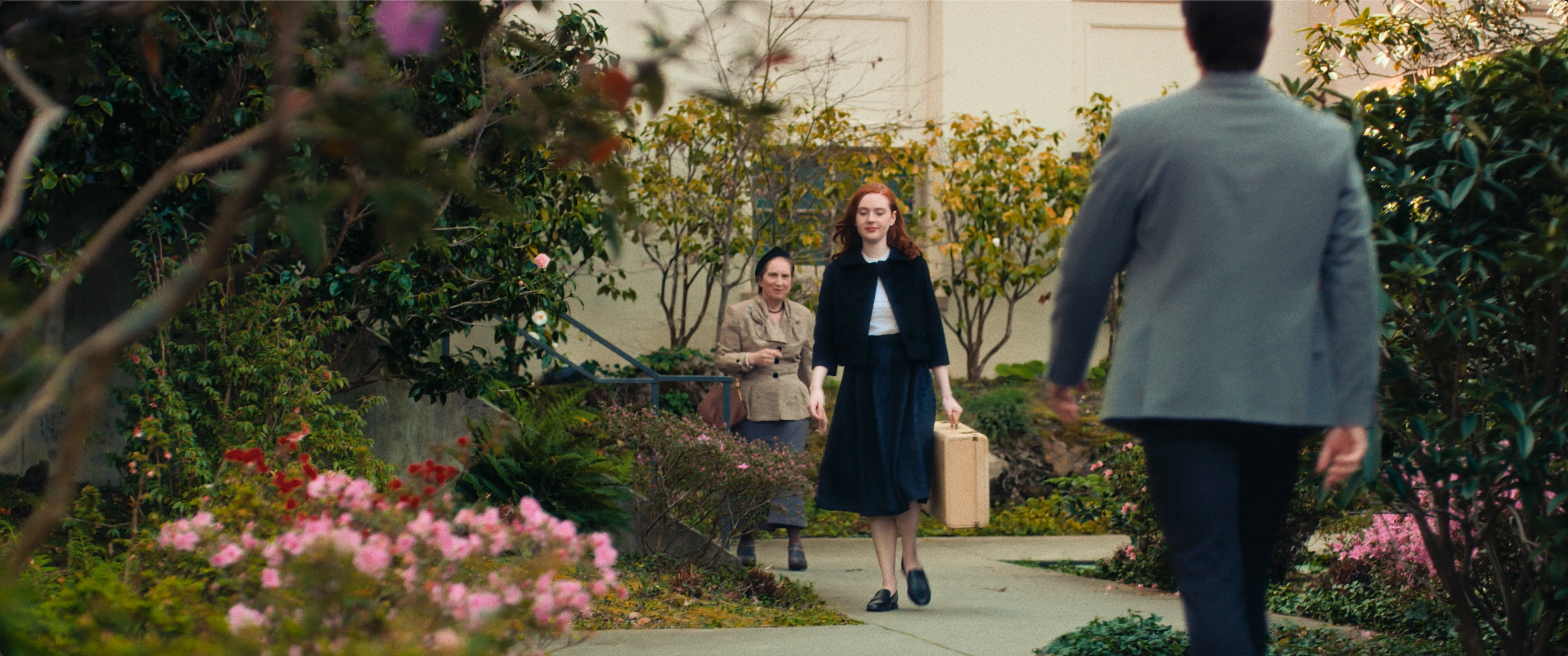
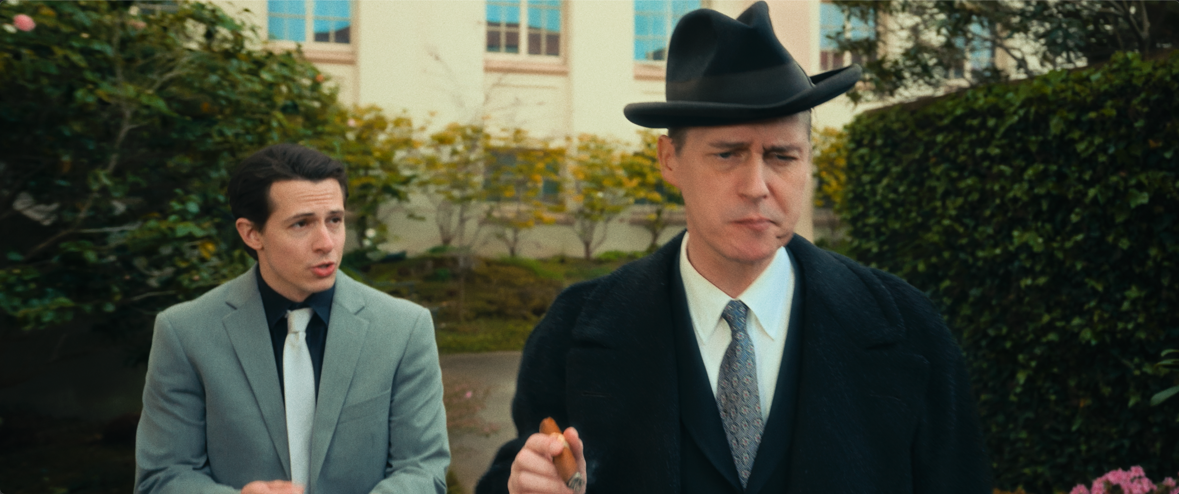
The images came from a Sony FX9 and a Blackmagic 6K shooting RAW, which gave me enough latitude to push each era into its own palette. For the 1920s, we wanted the world to feel old, warm, and naturalistic, with yellow and sepia‑leaning tones that suggest early color processes and all the depth and detail of a modern film. The Irish 1920s sequences shifted into a colder register: deep, saturated greens in the landscape and carefully protected fair skin tones.
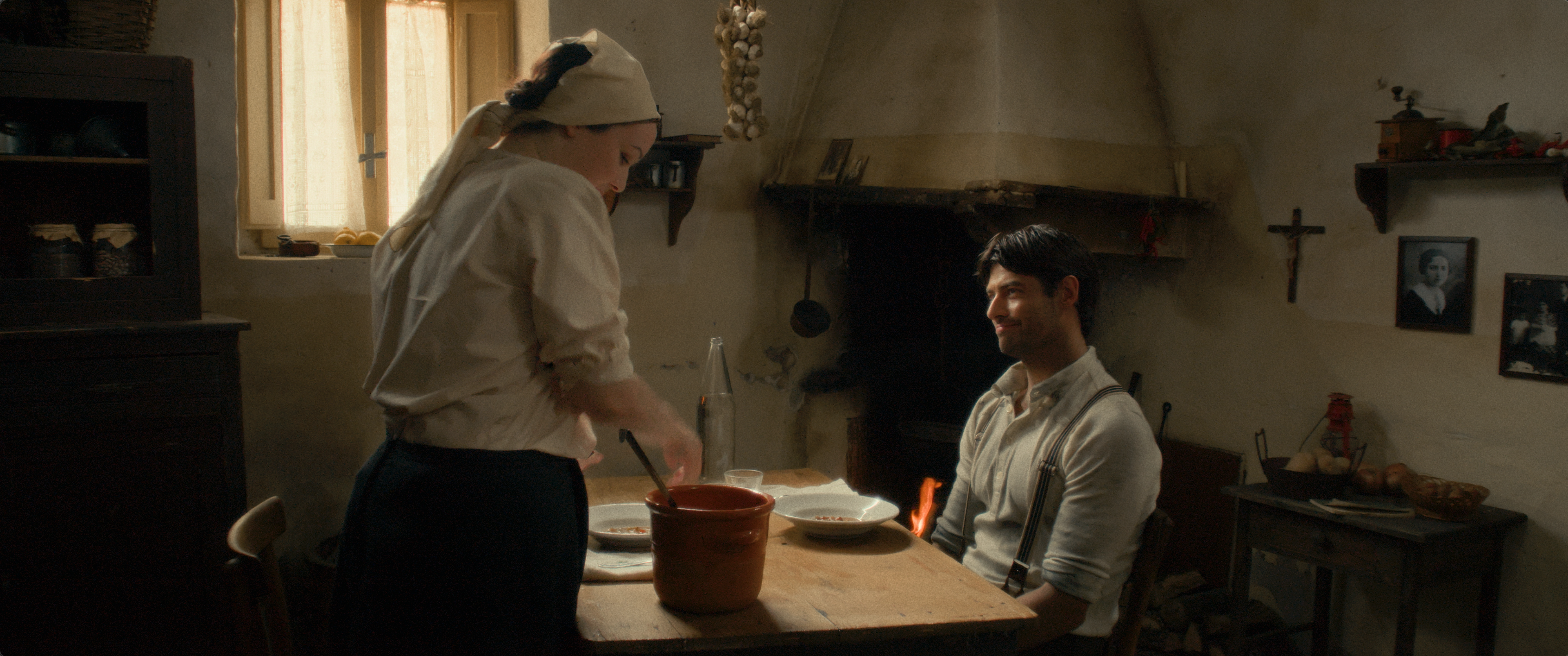
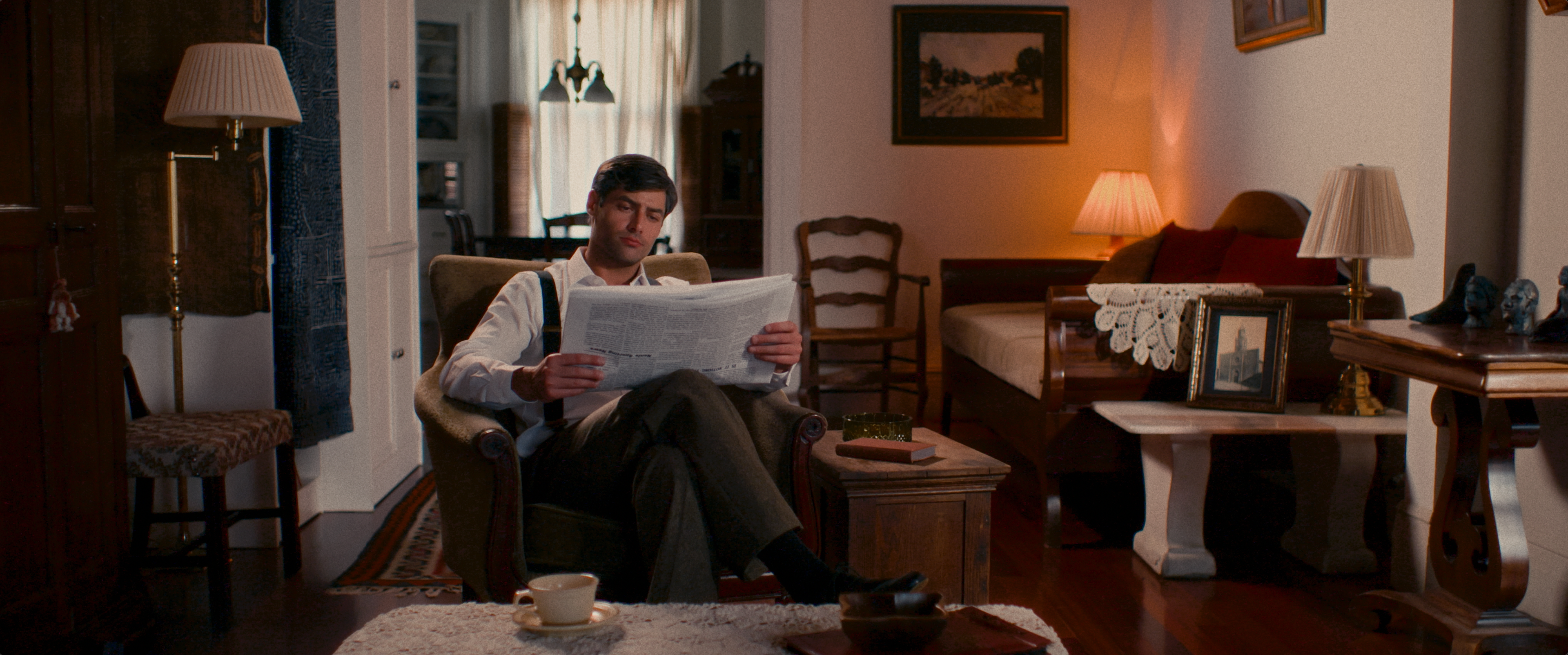
By the time we reach the 1950s, the world opens up: more color, more naturalism, a slight polish that hints at mid‑century optimism. Here the 2383‑style print curve carries more weight, adding snap to the contrast while keeping highlights creamy and shadows rich. The challenge—and the fun—was keeping the film coherent as a whole while letting each period have its own visual identity, so that you can almost feel the decade you’re in before anyone says a word.